Visualizing the Growth in Working Age Populations Over 10 Years

Link: https://www.visualcapitalist.com/growth-in-working-age-populations-over-10-years/

Graphic:
Excerpt:

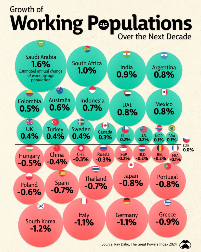
Today, the working age population in almost half of U.S. metropolitan areas has declined due to demographic shifts, and this trend is set to continue.

As a result, the U.S. workforce is projected to grow at just 0.2% annually over the next decade, roughly a quarter of the rate of markets like India and Mexico. Given the low birth rates and aging populations across many advanced economies, the world’s workforce is set to change significantly, with implications for economic and productivity growth.

This graphic shows the projected growth in major economies’ working age population, based on analysis from Ray Dalio’s Great Powers Index 2024.

Author(s): Dorothy Neufeld

Publication Date: 23 Sept 2024

Publication Site: Visual Capitalist
Visualizing the American Workforce as 100 People

Link: https://www.visualcapitalist.com/american-workforce-100-people/

Graphic:

Excerpt:

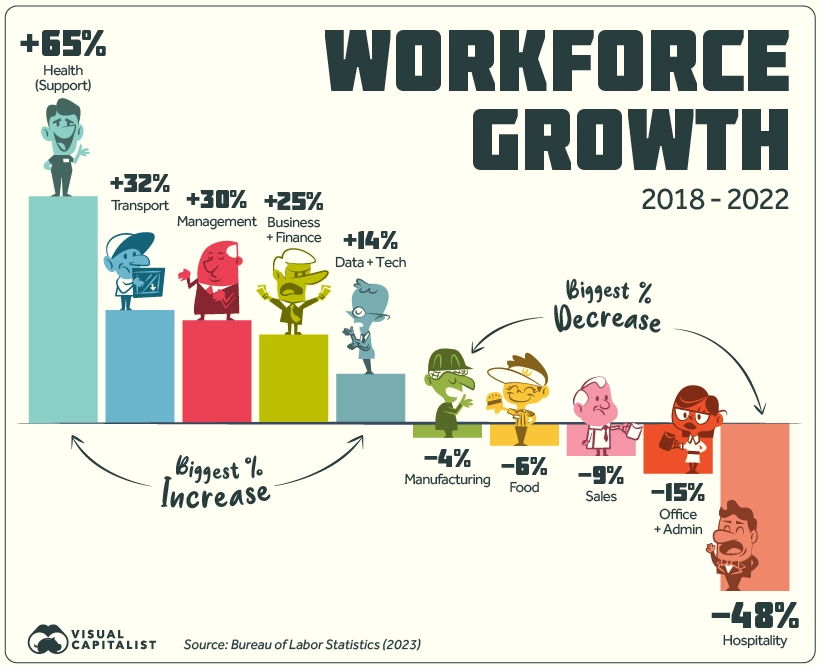
Over the last five years, the American workforce has not stayed static. Of the listed 22 groups, 13 saw growth in employment numbers, nine saw a decrease, and one stayed flat since 2018.

The top gainer by far is Health Support (medical assistants, care aides, orderlies, etc.) which grew by 65%. Looking at the timeline of growth does not paint a steady picture: employment jumped between 2018 and 2019, briefly fell in 2020, and has since risen again in 2021-2022.

Another top gainer is Transport, rising from the 4th to 3rd biggest employer, beating out Sales in 2022. Business & Finance and Management have also seen steady increases since 2018.

On the other hand Hospitality saw a staggering 48% drop in numbers, not all together surprising given the impact of the COVID-19 pandemic as well as the rise of tech companies like Airbnb.

Meanwhile, Office & Admin work saw a 15% loss in employees, even though this category is still the biggest employer in the country by a significant margin. Although jobs in this group saw steady declines from 2018-2021, it registered a slight uptick in workers between 2021 and 2022.

Author(s): Pallavi Rao

Publication Date: 15 May 2023

Publication Site: Visual Capitalist
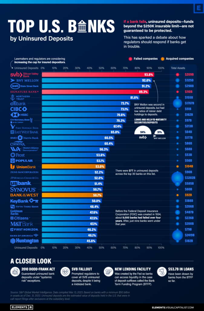
Ranked: The U.S. Banks With the Most Uninsured Deposits

Link: https://elements.visualcapitalist.com/ranked-the-u-s-banks-with-the-most-uninsured-deposits/

Graphic:

Excerpt:

Today, there is at least $7 trillion in uninsured bank deposits in America.

This dollar value is roughly three times that of Apple’s market capitalization, or about equal to 30% of U.S. GDP. Uninsured deposits are ones that exceed the $250,000 limit insured by the Federal Deposit Insurance Corporation (FDIC), which was actually increased from $100,000 after the Global Financial Crisis. They account for roughly 40% of all bank deposits.

In the wake of the Silicon Valley Bank (SVB) fallout, we look at the 30 U.S. banks with the highest percentage of uninsured deposits, using data from S&P Global.

Author(s): Dorothy Neufeld, Sabrina Lam

Publication Date: 4 April 2023

Publication Site: Visual Capitalist
Interest Rate Hikes vs. Inflation Rate, by Country

Link: https://www.visualcapitalist.com/interest-rate-hikes-vs-inflation-rate-by-country/

Graphic:

Excerpt:

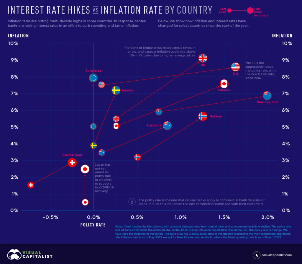
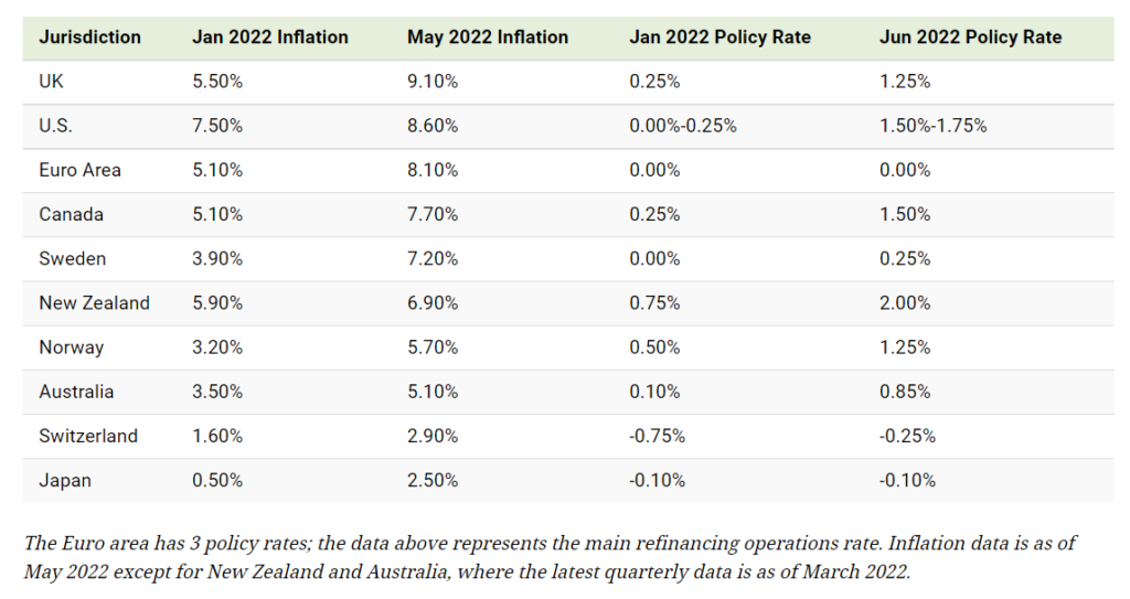
To understand how interest rates influence inflation, we need to understand how inflation works. Inflation is the result of too much money chasing too few goods. Over the last several months, this has occurred amid a surge in demand and supply chain disruptions worsened by Russia’s invasion of Ukraine.

In an effort to combat inflation, central banks will raise their policy rate. This is the rate they charge commercial banks for loans or pay commercial banks for deposits. Commercial banks pass on a portion of these higher rates to their customers, which reduces the purchasing power of businesses and consumers. For example, it becomes more expensive to borrow money for a house or car.

Ultimately, interest rate hikes act to slow spending and encourage saving. This motivates companies to increase prices at a slower rate, or lower prices, to stimulate demand.

Author(s): Jenna Ross, Nick Routley

Publication Date: 24 June 2022

Publication Site: Visual Capitalist
Mapped: The Top U.S. Exports by State

Link: https://www.visualcapitalist.com/cp/mapped-the-top-us-exports-by-state/

Graphic:

Excerpt:

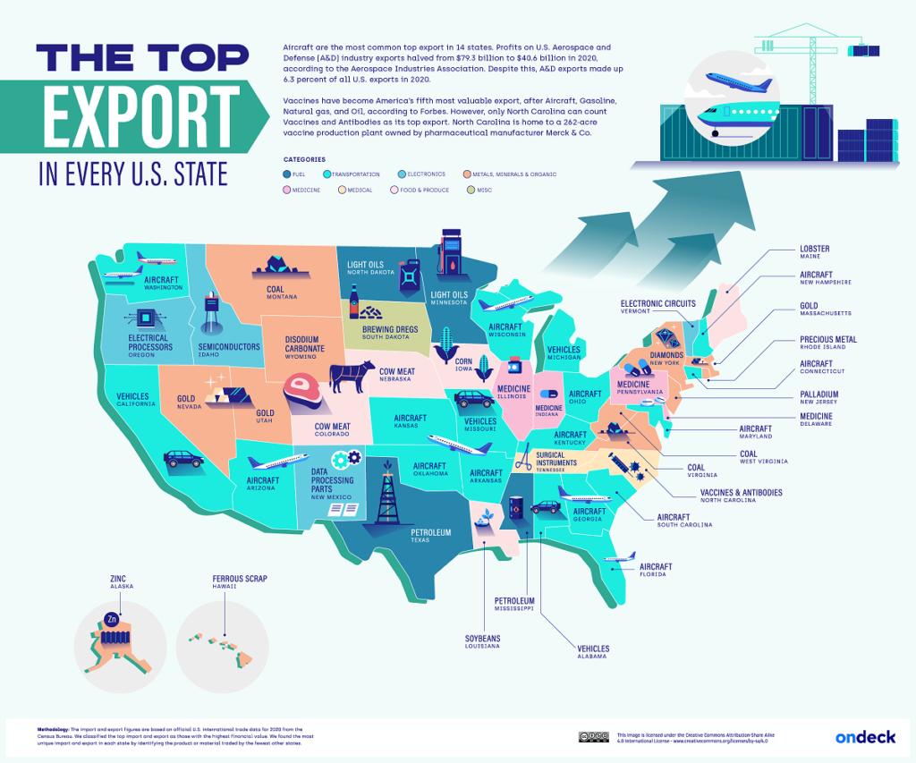
The U.S. exported over $1.3 trillion in goods in 2020, the second-highest amount worldwide.

While refined petroleum was the top export overall at $58.4 billion, aircraft exports were actually the highest across 14 states—more than any other form of export.

This infographic from OnDeck shows America’s top exports by state, using January 2022 data from the U.S. Census Bureau.

Author(s): NeoMam Studios, Dorothy Neufeld

Publication Date: 19 Jul 2022

Publication Site: Visual Capitalist
Charted: The Global Decline of Fertility Rates

Link: https://www.visualcapitalist.com/cp/charted-the-global-decline-of-fertility-rates/

Graphic:

Excerpt:

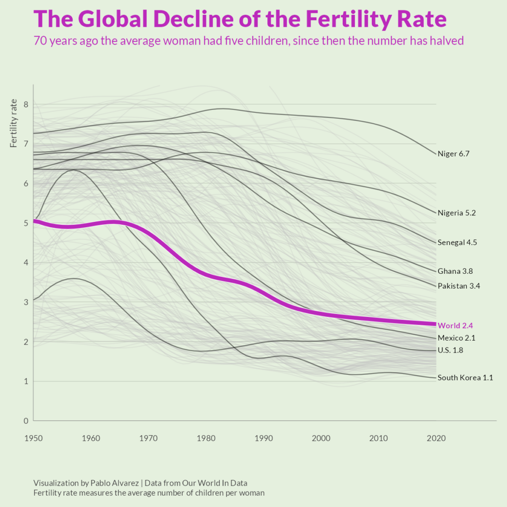
Over the last 50 years, fertility rates have dropped drastically around the world. In 1952, the average global family had five children—now, they have less than three.

This graphic by Pablo Alvarez uses tracked fertility rates from Our World in Data to show how rates have evolved (and largely fallen) over the past decades.

What’s The Difference Between Fertility Rates and Birth Rates?

Though both measures relate to population growth, a country’s birth rate and fertility rate are noticeably different:

  • Birth Rate: The total number of births in a year per 1,000 individuals.
  • Fertility Rate: The total number of births in a year per 1,000 women of reproductive age in a population.

Author(s): Pablo Alvarez

Publication Date: 10 Jun 2022

Publication Site: Visual Capitalist
Visualizing the Three Different Types of Inflation

Link: https://advisor.visualcapitalist.com/three-different-types-of-inflation/

Graphic:

Excerpt:

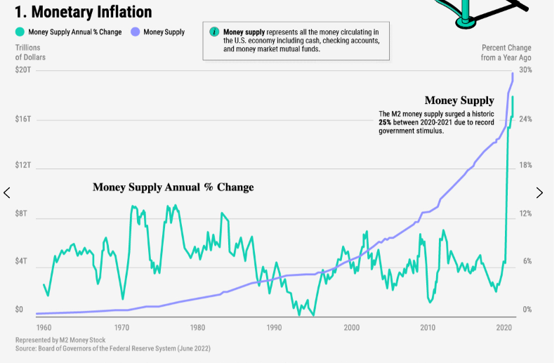
Monetary inflation occurs when the U.S. money supply increases over time. This represents both physical and digital money circulating in the economy including cash, checking accounts, and money market mutual funds.

The U.S. central bank typically influences the money supply by printing money, buying bonds, or changing bank reserve requirements. The central bank controls the money supply in order to boost the economy or tame inflation and keep prices stable.

Between 2020-2021, the money supply increased roughly 25%—a historic record—in response to the COVID-19 crisis. Since then, the Federal Reserve began tapering its bond purchases as the economy showed signs of strength.

Author(s): Dorothy Neufeld

Publication Date: 16 Jun 2022

Publication Site: Visual Capitalist

Mapped: A Decade of Population Growth and Decline in U.S. Counties

Link: https://www.visualcapitalist.com/mapping-a-decade-of-us-population-growth/

Graphic:

Excerpt:

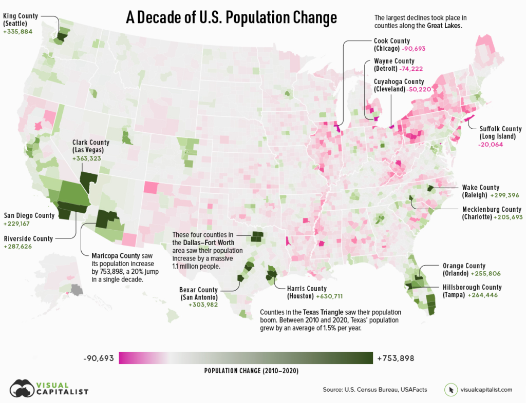
If an area sees a high number of migrants, along with a strong birth rate and low death rate, then its population is bound to increase over time. On the flip side, if more people are leaving the area than coming in, and the region’s birth rate is low, then its population will likely decline.

Which areas in the United States are seeing the most growth, and which places are seeing their populations dwindle?

This map, using data from the U.S. Census Bureau, shows a decade of population movement across U.S. counties, painting a detailed picture of U.S. population growth between 2010 and 2020.

Author(s): Nick Routley
Article/Editing: Carmen Ang

Publication Date: 16 Jun 2022

Publication Site: Visual Capitalist
Visualizing the Coming Shift in Global Economic Power (2006-2036p)

Link: https://www.visualcapitalist.com/shifting-global-economic-power/

Graphic:

Excerpt:

China is expected to surpass the U.S. by the year 2030. A faster than expected recovery in the U.S. in 2021, and China’s struggles under the “Zero-COVID” policies have delayed the country taking the top spot by about two years.

China has maintained its positive GDP growth due to the stability provided by domestic demand. This has proven crucial in sustaining the country’s economic growth. China’s fiscal and economic policy had focused on this prior to the pandemic over fears of growing Western trade restrictions.

Author(s): Raul Amoros

Publication Date: 13 Jun 2022

Publication Site: Visual Capitalist
The Inflation Rate in the U.S.: Past, Present, and Future

Link:https://advisor.visualcapitalist.com/the-inflation-rate-in-the-u-s-past-present-and-future/

Graphic:

Excerpt:

There are a number of periods in history where the inflation rate in the U.S. was heightened. For instance, a booming economy in the late ‘60s led to rising prices. President Nixon implemented wage-price shocks to halt inflation, but this eventually caused a recession.

In the years that followed, surging oil prices were a primary culprit behind periods of higher inflation. The early ‘70s were impacted by the oil embargo, when OPEC countries stopped oil exports to the United States. At the same time, U.S. oil producers didn’t have additional capacity and non-OPEC oil sources were declining as a proportion of the world oil market. This meant the U.S. was unable to increase supply to meet demand, and OPEC countries had more power to influence oil prices.

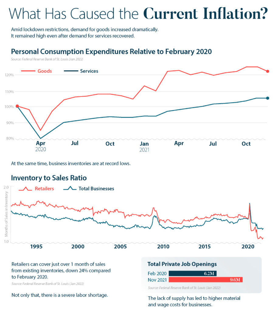
Fast forward to 2021, and the COVID-19 recovery has again led to a higher inflation rate in the United States. A number of factors are responsible, including surging consumer demand, supply chain problems, and a labor shortage.

Author(s): Jenna Ross

Publication Date: 6 Feb 2022

Publication Site: Visual Capitalist
Mapped: Visualizing U.S. Oil Production by State

Link:https://www.visualcapitalist.com/mapped-u-s-oil-production-by-state/

Graphic:

Excerpt:

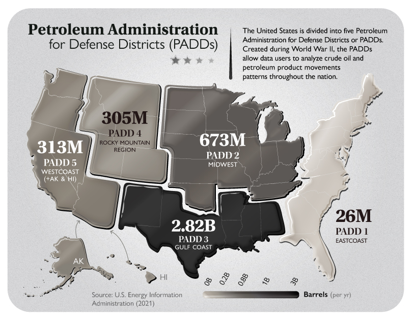
A total of 32 of the 50 U.S. states produce oil. They are divided among five regional divisions for oil production in the U.S., known as the Petroleum Administration for Defense Districts (PADD).

These five regional divisions of the allocation of fuels were established in the U.S. during the Second World War and are still used today for data collection purposes.

Given that Texas is the largest U.S. oil-producing state, PADD 3 (Gulf Coast) is also the largest oil-producing PADD. PADD 3 also includes the federal offshore region in the Gulf of Mexico. There are around 400 operational oil and gas rigs in the country.

Author(s): Anshool Deshmukh

Publication Date: 10 Aug 2021

Publication Site: Visual Capitalist

Visualizing the 700-Year Fall of Interest Rates

Link: https://www.visualcapitalist.com/700-year-decline-of-interest-rates/

Graphic:

Excerpt:

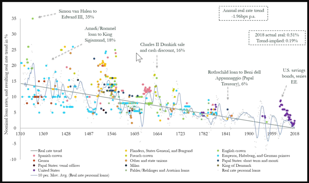
Today’s graphic from Paul Schmelzing, visiting scholar at the Bank of England (BOE), shows how global real interest rates have experienced an average annual decline of -0.0196% (-1.96 basis points) throughout the past eight centuries.

The Evidence on Falling Rates

Collecting data from across 78% of total advanced economy GDP over the time frame, Schmelzing shows that real rates* have witnessed a negative historical slope spanning back to the 1300s.

Displayed across the graph is a series of personal nominal loans made to sovereign establishments, along with their nominal loan rates. Some from the 14th century, for example, had nominal rates of 35%. By contrast, key nominal loan rates had fallen to 6% by the mid 1800s.

Author(s): Dorothy Neufeld

Publication Date: 4 Feb 2020

Publication Site: Visual Capitalist