COVID cases and deaths are on the rise

Link:https://www.axios.com/covid-cases-deaths-vaccines-omicron-0623380c-e665-435d-a144-4996e74ef5ff.html?mc_cid=0b15989f29&mc_eid=983bcf5922

Graphic:

Excerpt:

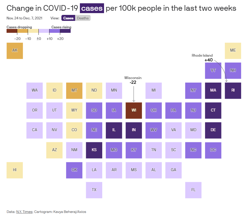
Where it stands: The U.S. is now averaging roughly 120,000 new COVID cases per day, a 26% increase over the past two weeks.

Average cases briefly dipped below 100,000 as the summer’s Delta wave receded, but the virus has rebounded quickly. New infections were climbing even before Thanksgiving, and holiday travel likely is accelerating the virus’ spread even further.

Deaths are also on the rise, after tapering off in the fall.

The virus is now killing about 1,300 Americans per day, on average. That’s a 14% increase over the past two weeks.

At this rate, the U.S. will pass 800,000 total deaths — roughly equivalent to the population of the Charleston, South Carolina, metro area — before Christmas.

Author(s): Sam Baker, Kavya Beheraj

Publication Date: 9 Dec 2021

Publication Site: Axios
Four(plus) Ways to Visualize Geographic Time Data

Link: https://policyviz.com/2021/05/11/fourplus-ways-to-visualize-geographic-time-data/

Graphic:

Excerpt:

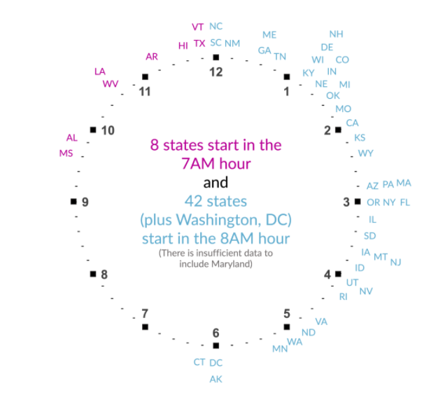
The last visualization I tried was to really embrace the idea of time in the data. Instead of a map or bar chart or something else, I placed the state abbreviations around two clock faces. I know it sounds weird, but take a look at the final version.

I think this is a fun visualization, and it communicates more precisely the exact average starting times than the previous graphs. The two clocks could be combined to one, but I worry it’s not quite as clear, so I tried using the different colors to differentiate the two hours.

Author(s): Jon Schwabish

Publication Date: 11 May 2021

Publication Site: PolicyViz

Opioid deaths in America reached new highs in the pandemic

Link: https://www.economist.com/graphic-detail/2021/03/30/opioid-deaths-in-america-reached-new-highs-in-the-pandemic

Graphic:

Excerpt:


LAST YEAR was a woeful time for people suffering from a drug addiction. Government shutdowns brought job losses and social isolation—conditions that make a transportive high all the more enticing. Those who had previously used drugs with others did so alone; if they overdosed, no one was around to call for help or administer naloxone, a medication that reverses opioid overdoses.

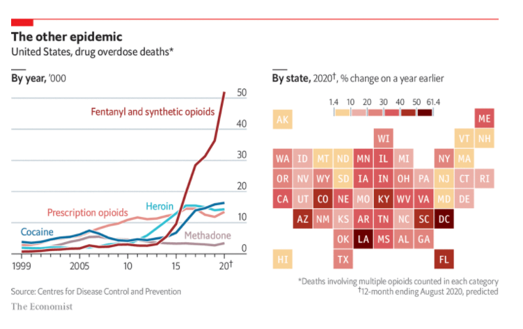
Fatal overdoses were marching upwards before the pandemic. But they leapt in the first part of last year as states locked down, according to provisional data from the Centres for Disease Control and Prevention. Deaths from synthetic opioids—the biggest killer—were up by 52% year-on-year in the 12 months to August, the last month for which data are available. Those drugs killed nearly 52,000 Americans during the period; cocaine and heroin killed about 16,000 and 14,000, respectively (see chart). Once fatalities are fully tallied for 2020, in a few months’ time, it is likely to be the deadliest year yet in America’s opioid epidemic.

Publication Date: 30 March 2021

Publication Site: The Economist

Five Charts You’ve Never Used but Should

Link: https://policyviz.com/2021/02/08/five-charts-youve-never-used-but-should/

Graphic:

Excerpt:

We are not born knowing instinctively how to read a bar chart or line chart or pie chart. Most of us learn those basic chart types in grade school. But there is a vast array of graphic types available that can effectively communicate your work to your audience.

In my new book, Better Data Visualizations: A Guide for Scholars, Researchers, and Wonks, I survey more than eighty visualization types, everything from histograms to horizon charts, ridgeline plots to choropleth maps, and explain how each has its place in the visual toolkit.

To get you started, here are five graphs that perhaps you’ve never used before but that you should consider. They either do a better job showing certain types of data or they are more engaging and interesting than basic chart types.

Author(s): Jonathan Schwabish

Publication Date: 8 February 2021

Publication Site: PolicyViz

Mortality with Meep: On The Congressional Body of Old Folks and Deaths in Office

Link: https://marypatcampbell.substack.com/p/mortality-with-meep-on-the-congressional

Graph:

Excerpt:

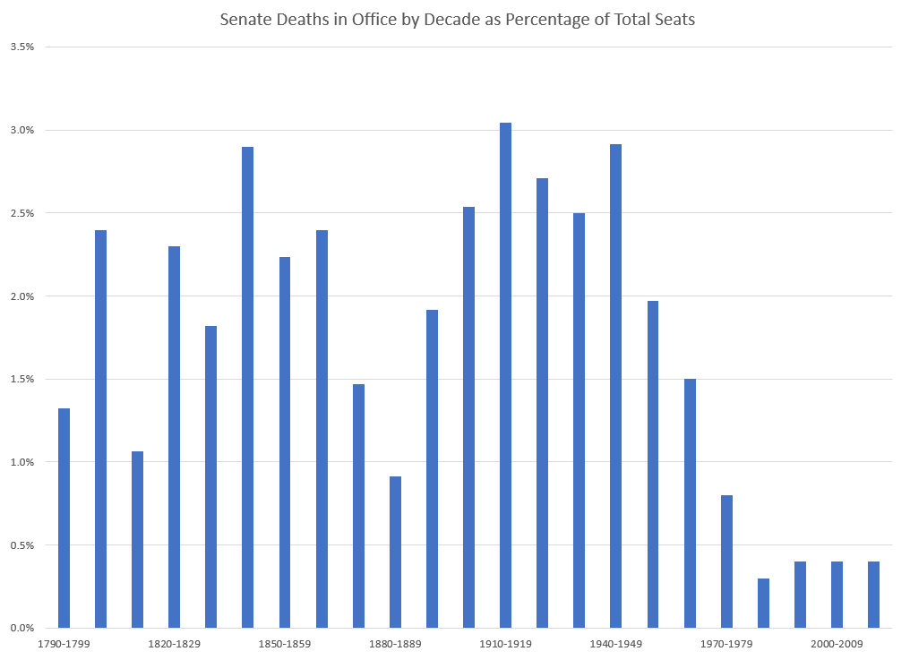
The next fact should tickle the interest of one of my friends who likes to keep stoopid stats (his term) about all sorts of things: with the death of John McCain, every state except Utah has had a senator die while in office.

Isn’t that exciting?

Author(s): Mary Pat Campbell

Publication Date: 8 February 2021

Publication Site: STUMP