Link:https://results4america.org/tools/arp-dashboard/
Graphic:
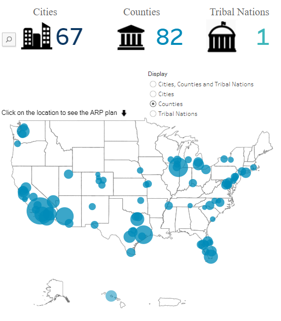
Excerpt:
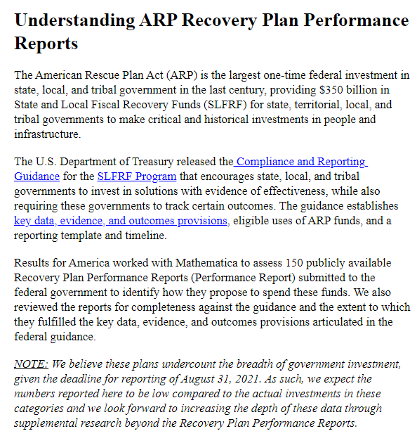
Accessed: 6 December 2021
Publication Site: Results for America
All about risk
Link:https://results4america.org/tools/arp-dashboard/
Graphic:

Excerpt:

Accessed: 6 December 2021
Publication Site: Results for America
Video:
Description:
I review national-level U.S. mortality data from 2020 into 2021 (last updated 3/17/2021, weekly data through the week ending 3/6/2021), using the CDC’s own dashboards.
Breakdown by total numbers, states, age group, racial/ethnic group, non-COVID major causes.
CDC excess mortality dashboards: https://www.cdc.gov/nchs/nvss/vsrr/covid19/excess_deaths.htm
Author(s): Mary Pat Campbell
Publication Date: 18 March 2021
Publication Site: Meep’s Math Matters at YouTube
Link: https://www.tableau.com/about/blog/2021/2/data-science-and-future-visualization-tools-reflection
Graphic:
Excerpt:
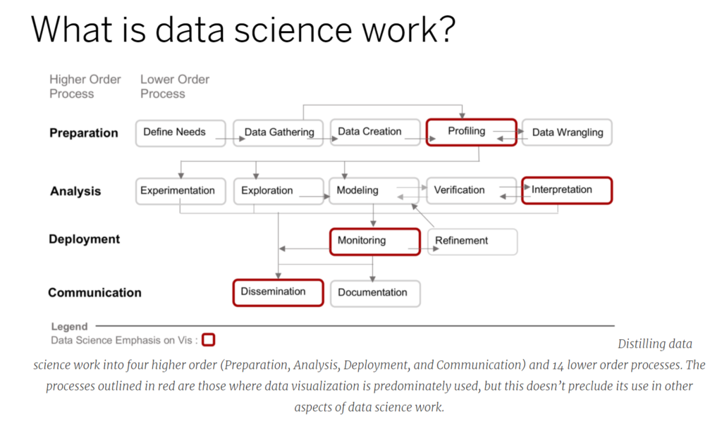
Importantly, a working definition of data science narrows the scope of research. Instead of considering all possible types of data analysis that one may wish to conduct, we look closely at the types of analyses data scientists carry out. This distinction is important as the specific steps that, say, an experimental physicist takes to analyze data are different, even though they share commonalities, than the analytic steps a data scientist may take. Which leads to an important follow on: what exactly is data science work?
There have been several industry standards for breaking down data science work. The first was the KDD (or Knowledge in Data Discovery) method, that over time was modified and expanded upon by others. From these derivations, as well as studies that interview data scientists, we created a framework that has four higher order processes (preparation, analysis, deployment, and communication) and 14 lower order processes. Using the red stroke outline we also highlighted the specific areas where data visualization already plays a prominent role in data science work. In our research article we provide detailed definitions and examples of these processes.
Author(s): ANA CRISAN
Publication Date: 24 February 2021
Publication Site: Tableau
Link: https://www.datablick.com/blog/2021/2/4/a-tableau-accessibility-journey-part-i
Graphic:
Excerpt:
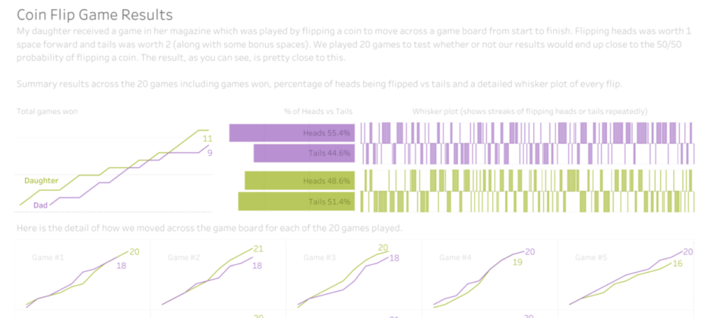
Recently, I came to the realization that 0 of my 58 published data visualizations on my Tableau Public profile provide equal access of their data and storylines for all users, mostly excluding those with disabilities. I have read and studied a lot about developing visuals with care for color blindness, but not so much for blindness itself, or low vision, or users who cannot use a mouse, or many other disabled users. A recent Twitter thread by our colleague Frank Elavsky hits on this topic. It is through these realizations that I decided to join and contribute to the dataviza11y group. A quick plug that we have a great group of people, looking to do some exciting things in this space, so do check out and follow that group and it’s member’s activities if you are interested. A wonderful and recent example is the talk Frank, Sarah Fossheim and Larene Le Gassick presented at Outlier.
Author(s): Chris DeMartini
Publication Date: 8 February 2021
Publication Site: Data Blick
Link: https://www.soa.org/resources/research-reports/2020/visualizations-of-covid-19/
Sublinks: [Tableau dashboards]
Publication Site: SOA