Taxing Tuesday: The SALT Cap Battle Continues

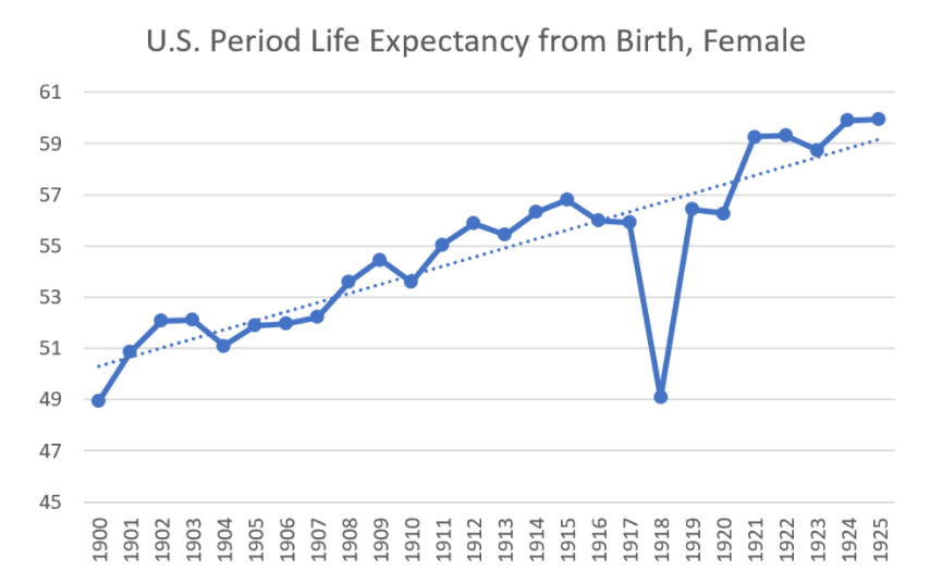
Link: https://marypatcampbell.substack.com/p/taxing-tuesday-the-salt-cap-battle

Graphic:

Excerpt:

 ….these representatives are doing exactly what they should be doing: representing the interests of the people of their districts.

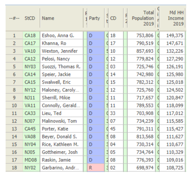
This helpful site provides all sorts of statistics by Congressional district.

According to their data, Tom Suozzi’s district, NY-3, has a median household income of $120K. Gottheimer’s district, NJ-5, has a median household income of $110K.

….

Of the top 50 congressional districts by median household income, they are represented by 42 Democrats and 8 Republicans.

The top 17 districts are all represented by Democrats. You have to get to #18 to get to your first Republican.

Nancy Pelosi’s district is at #4. That must burn her britches. Do better, San Franciscans!

Suozzi’s district is at #5.

Gottheimer’s district is at #16.

Author(s): Mary Pat Campbell

Publication Date: 10 August 2021

Publication Site: STUMP at substack

Mortality with Meep: Cause of Death Trend — Cancer — 1999-2020

Link: https://marypatcampbell.substack.com/p/mortality-with-meep-cause-of-death-76e

Video:

Graphic:

Excerpt:

As with heart disease, we see improvement at all ages, but the percentage improvement is not as high with cancer as it was with heart disease.

One of the biggest things, though, is how death rates go up by age group. I will use 2020Q1 cause of death rates to make comparisons, as these are in the SOA report, and the COVID impact didn’t come fully until 2020Q2.

Heart disease death rate for those aged 85+ was 3766 per 100K, and those aged 75-84 was 986. That’s a ratio of 3.8.

Cancer deaths for those aged 85+ was 1562 per 100K, and those aged 75-84 was 1004. That’s a ratio of 1.6.

Two things to note:

Cancer death rate for those age 75-84 was higher than the heart disease death rate for the same group

Heart disease death rates climb much more rapidly than cancer death rates by age

Author(s): Mary Pat Campbell

Publication Date: 4 August 2021

Publication Site: STUMP at substack

COVID and Simpson’s Paradox: Why So Many Vaccinated People are Among the Current Wave of Hospitalizations

Link: https://marypatcampbell.substack.com/p/covid-and-simpsons-paradox-why-so

Graphic:

Excerpt:

when you’ve got really steep differences between subpopulations and the subpopulations are of very different sizes, the overall population average will be very different from simply looking at the average of the two populations.

Basically:

– The base risk rates for each group are extremely different (3.9 per 100K for young, and 91.9 per 100K for old)
– The percentage each subpopulation makes up in the larger population is very different (67% young, 33% old)
– The vaccination rates are very different by population (76% young, 92% old)

Author(s): Mary Pat Campbell

Publication Date: 19 August 2021

Publication Site: STUMP at substack

Mortality with Meep: Cause of Death Trend — Heart Disease — 1999-2020

Link: https://marypatcampbell.substack.com/p/mortality-with-meep-cause-of-death

Video:

Graphic:

Excerpt:

The long-term trend has been improvement for this cause of death, with it most obvious for the oldest age groups. This trend has been driven by improvement in medical treatment for the condition, but also due to the decrease in smoking rates… decades ago. Some causes of death have behavior that precedes the death by decades, which can get tricky to track for our top two causes of death: heart disease and cancer. Even so, smoking cigarettes has been a huge driver for both these causes, and made a large differentiator by sex and smoking status for a long time.

Author(s): Mary Pat Campbell

Publication Date: 26 July 2021

Publication Site: STUMP at substack

Mortality with Meep: Huge Increase in Death by Drug Overdose in 2020

Link: https://marypatcampbell.substack.com/p/mortality-with-meep-huge-increase

Graphic:

Excerpt:

In 2020, there were over 93K deaths due to drug overdoses — a 30% increase over 2019.

This is super-bad, and worse than what I have seen for increases in other causes of death. I knew it was going to be bad, but I didn’t realize it was going to be this bad.

Author(s): Mary Pat Campbell

Publication Date: 14 July 2021

Publication Site: STUMP at substack

Mortality with Meep: U.S. Life Expectancy Fell 2.4% in 2020, and Death Rates Increased 16.1%

Link: https://marypatcampbell.substack.com/p/mortality-with-meep-us-life-expectancy

Graphic:

Excerpt:

The Spanish flu pandemic gives us the demonstration of what happens when there is a short-term large increase in mortality.

Using Social Security records of period life expectancy, there was a huge drop in life expectancy in 1918…. and then a huge increase in 1919. But going from 1917 to 1919 wasn’t really that big of a difference.

The period life expectancy drop was 12% for females, 13% for males in 1918.

Then there was an increase of 15% for females, 20% for males in 1919. The Spanish flu hit the U.S. hard in 1918, and let up in 1919.

If you compare 1919 against 1917, the life expectancy from birth increase was 1% for females, and 4% increase for males — male life expectancy was down in 1917 compared to 1916, probably related to World War I.

Author(s): Mary Pat Campbell

Publication Date: 29 June 2021

Publication Site: STUMP at substack

Mortality Nuggets: NYT Misleads, COVID Deaths Down, and Car Crash Fatalities Up

Link: https://marypatcampbell.substack.com/p/mortality-nuggets-nyt-misleads-covid

Graphic:

Excerpt:

I want you to notice something — the blue bars are the “with COVID” portion of deaths, and the chartreuse bars are the ones “without COVID”. The bars are weekly counts of deaths when they occurred. Ignore the most recent weeks because they don’t have full data reported yet.

The red pluses indicate excess mortality, defined as exceeding the 95th percentile for expected mortality for that week (so it includes seaonality). You can see the excess mortality from the 2017-2018 flu season, which was bad for a flu season.

The non-COVID mortality has been in excessive mortality range for almost all 2020 after March. But since the beginning of 2021, it has dropped off…. and COVID mortality has also dropped off.

I think we may be almost in “normal” range soon. We shall see!

Author(s): Mary Pat Campbell

Publication Date: 13 June 2021

Publication Site: STUMP at substack

National Public Pension Coalition vs. Truth in Accounting: Who is Accurate With Public Pension Unfunded Debt?

Link: https://marypatcampbell.substack.com/p/national-public-pension-coalition

Graphic:

Excerpt:

NPPC, I recommend you think through what will actually inform and protect your members. The TIA folks are not distorting the message, except to the extent that state and local governments are undervaluing their pension and OPEB promises.

Complaining about TIA will not make the pensions better-funded. Complaining about TIA will not prevent the worst-funded pensions from running out of assets, which will not be supportable as pay-as-you-go, as the asset death spiral before that will show that the cash flows were unaffordable for the local tax base.

And don’t look to the federal government to save your hash. So far bailout amounts have been puny compared to the size of the promises.

Author(s): Mary Pat Campbell

Publication Date: 9 June 2021

Publication Site: STUMP at substack

Not With a Bang, But a Whimper: Demographic Decline Undermines Public Finance

Link: https://marypatcampbell.substack.com/p/not-with-a-bang-but-a-whimper-demographic

Graphic:

Excerpt:

The last time the Census Bureau did a population projection, the estimated population for even 2020 came in a little high. From March 2018: Demographic Turning Points for the United States: Population Projections for 2020 to 2060 — they estimated a total population of about 332.6 million, and the apportionment Census results were 331.1 million. To be sure, this is a less than 0.5% difference, so no big deal.

This is the growth rate they projected, even in 2018:
2020-2030: 7%
2030-2040: 5%
2040-2050: 4%
2050-2060: 4%

Those are full-decade growth rates. That’s before the pandemic has shaved our numbers down a little.

Would you like to know the growth rates from prior decades?
2010-2020: 7%
2000-2010: 10%
1990-2000: 13%
1980-1990: 10%

Author(s): Mary Pat Campbell

Publication Date: 28 May 2021

Publication Site: STUMP at substack

Mortality with Meep: On Excess non-COVID Mortality in 2020

Link: https://marypatcampbell.substack.com/p/mortality-with-meep-on-excess-non

Graphic:

Excerpt:

All of the excess mortality for age 85+ can be explained by COVID, essentially

Very little of the excess mortality for those age 15-24 can be explained by COVID

There is a lot of excess mortality for those age 25-44 not explained by COVID

Author(s): Mary Pat Campbell

Publication Date: 22 May 2021

Publication Site: STUMP at substack

Mortality Nuggets: Global Excess Deaths, Memento Mori, and Mortality News Round-up

Link: https://marypatcampbell.substack.com/p/mortality-nuggets-global-excess-deaths

Video:

Excerpt:

In particular, it is pretty clear to me that specifically in the U.S., the non-COVID excess mortality has been very high. I do not think that’s under-counted COVID deaths. I think it’s due to other causes. We’ve already seen that car accident deaths were up, even though total miles driven was down by a lot.

So yay for their statistics in grabbing the excess deaths, but boo for assuming all those excess deaths were COVID.

Now, results of COVID and COVID policies, sure, I’d go with that. But do you want to start digging into the stats of suicides, drug overdoses, “accidental” deaths, and more? How about deaths of neglect? I bet that is involved in a bunch of non-COVID elderly deaths.

Author(s): Mary Pat Campbell

Publication Date: 18 May 2021

Publication Site: STUMP at substack

Which Public Pension Funds Have the Highest Holdings of Alternative Assets? 2021 Edition

Link: https://marypatcampbell.substack.com/p/which-public-pension-funds-have-the

Graphic:

All the data for alternative allocation 2001-2020, with key percentiles plotted as lines

Excerpt:

What you see in that graph is a data point for each of the plans I know their asset allocation for, with the median, 25th percentile, and 75th percentiles marked out so you can see the allocations increasing.

That pattern does not make me feel good.

Allocating more to alternatives doesn’t seem to get asset managers higher returns. But the group is generally sliding upwards in their allocations, and I’m very unhappy about this.

Author(s): Mary Pat Campbell

Publication Date: 11 May 2021

Publication Site: STUMP at substack