Why Do Vaccinated People Represent Most COVID-19 Deaths Right Now?

Link: https://www.kff.org/policy-watch/why-do-vaccinated-people-represent-most-covid-19-deaths-right-now/

Graphic:
Excerpt:

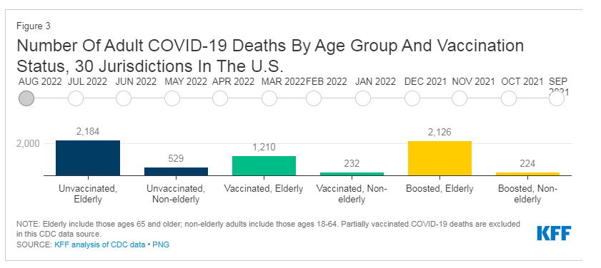
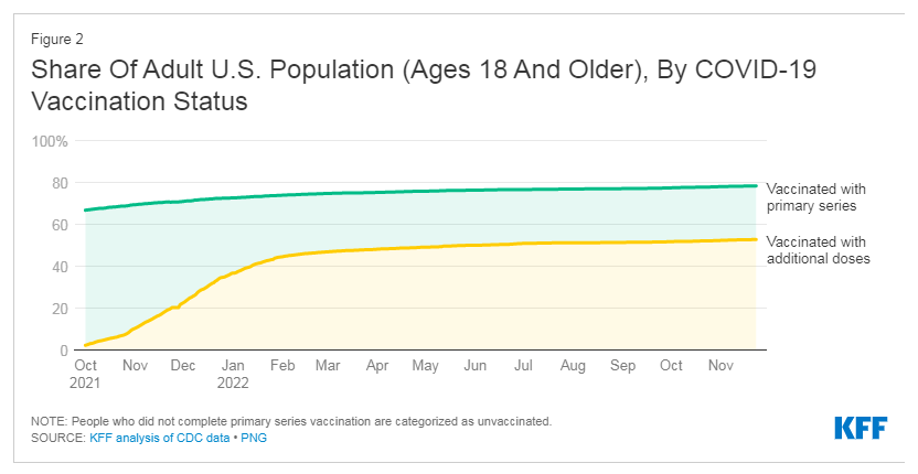
The waning protection from vaccines is why CDC recommends recent booster shots, and why it’s especially important for people at higher risk to stay up-to-date on boosters. Per current recommendations, most adults should have received at least 2-3 booster doses by now (including the new bivalent booster), in addition to their primary series. However, only 14% of adults overall and 31% of older adults (65 years and older) have received the latest bivalent boosters. The CDC data show that about 95% of adults who died from COVID-19 in 2022 in these jurisdictions were over age 50, and about 8 in 10 were age 65 or older, underscoring the need for older adults to stay up-to-date on recommended booster shots.

The fall in the share of deaths that are among unvaccinated people could also be explained by changes in the unvaccinated population. By this far into the pandemic, it is estimated that many unvaccinated people have had COVID-19 at least once and while hundreds of thousands of unvaccinated people have needlessly died from COVID, those who survived may have gained some immune protection against the virus that can help protect them against severe outcomes when they have subsequent infections. However, this protection from a past infection can also diminish over time, which is why it is still recommended that unvaccinated people with prior COVID-19 infections get vaccinated and stay up-to-date on boosters.

Author(s): Cynthia Cox Follow @cynthiaccox on Twitter , Krutika Amin Follow @KrutikaAmin on Twitter , Jennifer Kates Follow @jenkatesdc on Twitter , and Josh Michaud Follow @joshmich on Twitter

Publication Date: 30 Nov 2022

Publication Site: KFF
COVID Data Follies: Vaccination Rates, Relative Risk, and Simpson’s Paradox

Link:https://marypatcampbell.substack.com/p/covid-data-follies-vaccination-rates

Video:

Graphic:

Excerpt:

On Monday, December 6, 2021, I gave a talk with the title “COVID Data Follies: Vaccination Rates, Relative Risk, and Simpson’s Paradox”, to the Actuarial Science program at Illinois State University (thanks for the t-shirt, y’all!):

You may have heard statistics in the news that most of the people testing positive for COVID, currently, in a particular location, or most of the people hospitalized for COVID, or even most of the people dying of COVID were vaccinated! How can that be? Does that prove that the vaccines are ineffective? Using real-world data, the speaker, Mary Pat Campbell, will show how these statistics can both be true and misleading. Simpson’s Paradox is involved, which has to do with comparing differences between subgroups with very different sizes and average results. Simpson’s Paradox actually appears quite often in the insurance world.

I will embed a recording of the event, copies of the slides, the spreadsheets, and the links from the talk.

Author(s): Mary Pat Campbell

Publication Date: 8 Dec 2021

Publication Site: STUMP at substack

Simpson’s Paradox and Vaccines

Link:https://covidactuaries.org/2021/11/22/simpsons-paradox-and-vaccines/

Graphic:

Excerpt:

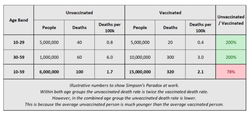
So what the chart in the tweet linked above is really showing is that, within the 10-59 age band, the average unvaccinated person is much younger than the average vaccinated person, and therefore has a lower death rate. Any benefit from the vaccines is swamped by the increase in all-cause mortality rates with age.

I have mocked up some illustrative numbers in the table below to hopefully show Simpson’s Paradox in action here. I’ve split the 10-59 age band into 10-29 and 30-59. Within each group the death rate for unvaccinated people is twice as high as for vaccinated people. However, within the combined group this reverses – the vaccinated group have higher death rates on average!

I and others have written to ONS, altering them to the concerns that this data is causing. It appears from a new blog they have released that they are aware of the issue and will use narrower age bands in the next release.

Author(s): Stuart Macdonald

Publication Date: 22 Nov 2021

Publication Site: COVID-19 Actuaries Response Group

COVID and Simpson’s Paradox: Why So Many Vaccinated People are Among the Current Wave of Hospitalizations

Link: https://marypatcampbell.substack.com/p/covid-and-simpsons-paradox-why-so

Graphic:

Excerpt:

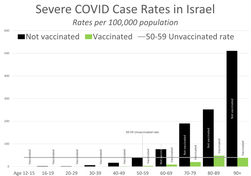
There you have it — for this slice of time, the beginning of August 2021, Israel shows that the vaccines reduced risk 80%+, for all age groups.

Yes, if you just do an aggregation at the whole population level, it looks like a 67% reduction. That’s the “magic” of Simpson’s Paradox. For any given age group, the percentage reduction is much larger. But due to the relative risks by age, even with such high reductions, the overall population result shows a smaller improvement.

Takeaway: COVID vaccines greatly reduce risk

This is the main takeaway: the COVID vaccines greatly reduce the risk of adverse outcomes.

By the way, this is also true of the annual flu vaccines, which range in efficacy based on how well the vaccine that year matches up with the strains circulating, and which strains are circulating (some strains, even if you formulated the vaccine perfectly, still infect.) I could give you flu/pneumonia death rates by age groups, and you would see that flu/pneumonia is a big killer of the elderly. Get your flu vaccines, please.

But, we should also expect a lot of people hospitalized with COVID to be vaccinated old folks. Just because of the huge risk slope by age, which will still exist after vaccination.

Author(s): Mary Pat Campbell

Publication Date: 19 August 2021

Publication Site: STUMP at substack

Israeli data: How can efficacy vs. severe disease be strong when 60% of hospitalized are vaccinated?

Link: https://www.covid-datascience.com/post/israeli-data-how-can-efficacy-vs-severe-disease-be-strong-when-60-of-hospitalized-are-vaccinated

Graphic:

Excerpt:

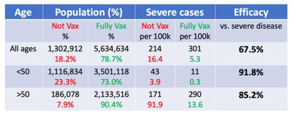
These efficacies are quite high and suggests the vaccines are doing a very good job of preventing severe disease in both older and young cohorts. These levels of efficacy are much higher than the 67.5% efficacy estimate we get if the analysis is not stratified by age. How can there be such a discrepancy between the age-stratified and overall efficacy numbers?

This is an example of Simpson’s Paradox, a well-known phenomenon in which misleading results can sometimes be obtained from observational data in the presence of confounding factors.

Author(s): Jeffrey Morris

Publication Date: 17 August 2021

Publication Site: Covid-19 Data Science

COVID and Simpson’s Paradox: Why So Many Vaccinated People are Among the Current Wave of Hospitalizations

Link: https://marypatcampbell.substack.com/p/covid-and-simpsons-paradox-why-so

Graphic:

Excerpt:

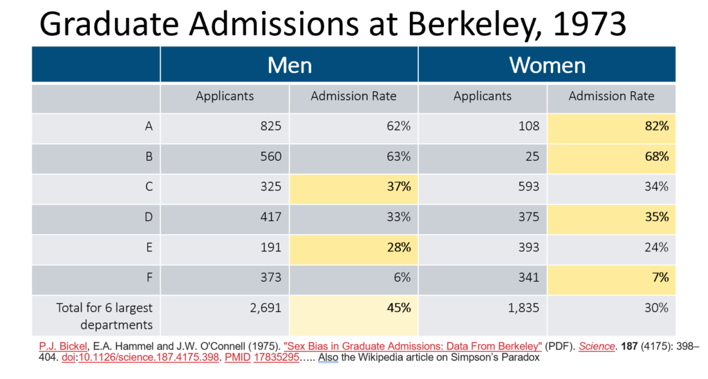
when you’ve got really steep differences between subpopulations and the subpopulations are of very different sizes, the overall population average will be very different from simply looking at the average of the two populations.

Basically:

– The base risk rates for each group are extremely different (3.9 per 100K for young, and 91.9 per 100K for old)
– The percentage each subpopulation makes up in the larger population is very different (67% young, 33% old)
– The vaccination rates are very different by population (76% young, 92% old)

Author(s): Mary Pat Campbell

Publication Date: 19 August 2021

Publication Site: STUMP at substack

Sex Bias in Graduate Admissions: Data from Berkeley

Link: https://science.sciencemag.org/content/187/4175/398

Graphic:

Excerpt:

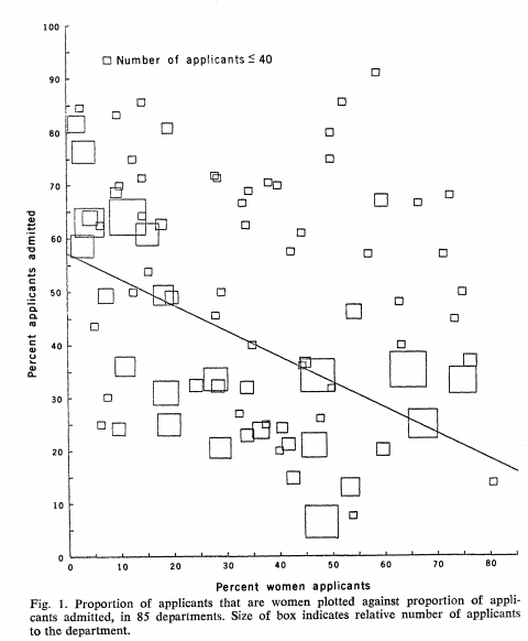
Examination of aggregate data on graduate admissions to the University of California, Berkeley, for fall 1973 shows a clear but misleading pattern of bias against female applicants. Examination of the disaggregated data reveals few decision-making units that show statistically significant departures from expected frequencies of female admissions, and about as many units appear to favor women as to favor men. If the data are properly pooled, taking into account the autonomy of departmental decision making, thus correcting for the tendency of women to apply to graduate departments that are more difficult for applicants of either sex to enter, there is a small but statistically significant bias in favor of women. The graduate departments that are easier to enter tend to be those that require more mathematics in the undergraduate preparatory curriculum. The bias in the aggregated data stems not from any pattern of discrimination on the part of admissions committees, which seem quite fair on the whole, but apparently from prior screening at earlier levels of the educational system. Women are shunted by their socialization and education toward fields of graduate study that are generally more crowded, less productive of completed degrees, and less well funded, and that frequently offer poorer professional employment prospects.

Science 
 07 Feb 1975:
Vol. 187, Issue 4175, pp. 398-404
DOI: 10.1126/science.187.4175.398

Author(s): P. J. Bickel, E. A. Hammel, J. W. O’Connell

Publication Date: 7 February 1975

Publication Site: Science

Never Trust a Clean Partisan Story

Link: https://polimath.substack.com/p/never-trust-a-clean-partisan-story

Graphic:

Before [wrong]:

After [correct]:

Excerpt:

The biggest problem with this study is the fact that they made what is an elementary statistics error and it went all the way to publication and no one caught it.

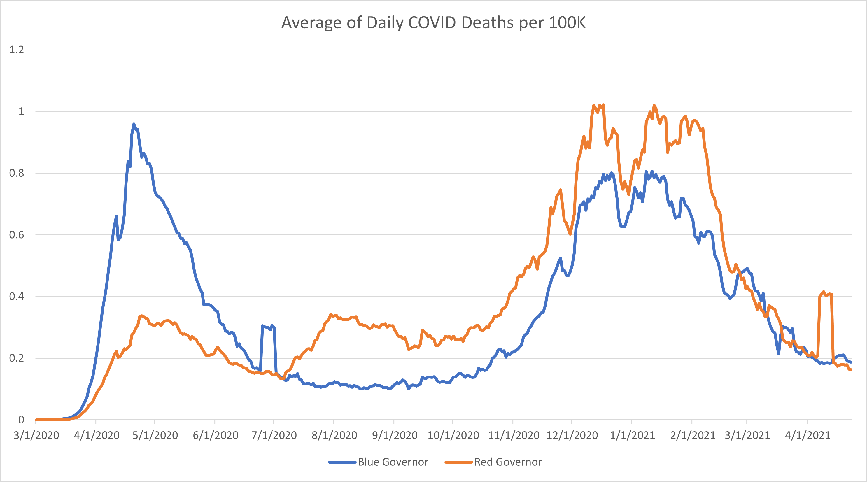
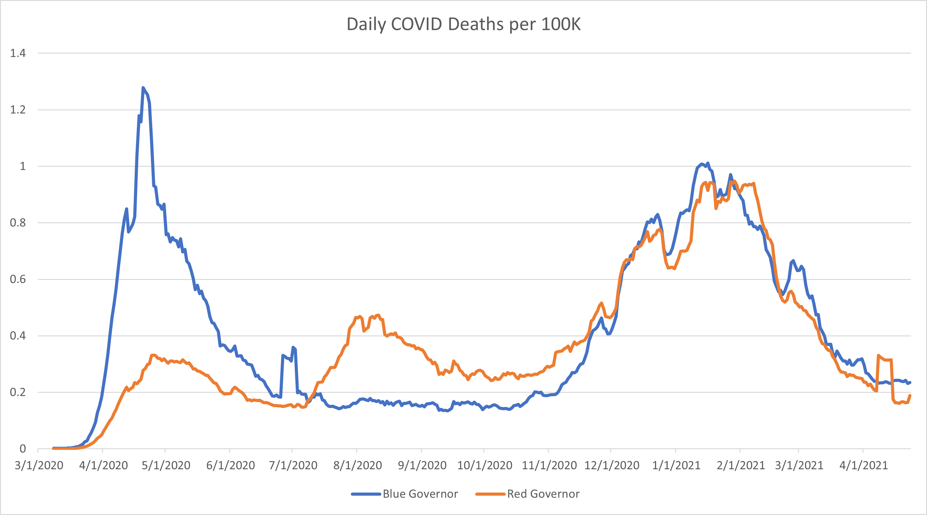
The authors took the per capita COVID case and death numbers among the “red states” and “blue states” and ran an analysis on them. In doing this, they gave North Dakota the same weight as Texas and Hawaii the same weight as New York despite the obvious population differences. Their chart is tiny and unreadable, so I’ve roughly duplicated their work here.

At first glance, this looks like the authors at least have their data correct. It looks like, after the initial wave, states with red governors had consistently higher patterns of cases and deaths from the summer all the way through the winter surge.

However, what we’re seeing here is due to the fact that the authors weighted the death rates for small and rural states with the same weight that they applied to high population states. This is a statistics error that is so common it has its own name: Simpson’s Paradox. It is when you take the average of the averages instead of calculating the overall average based on the properly weighted data.

Author(s): PoliMath

Publication Date: 13 May 2021

Publication Site: Marginally Compelling at substack