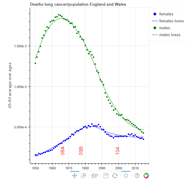
Link: https://mortchart-en.klpn.se/sexesyrs.html
Graphic:

Excerpt:
The aim of this site is to give comprehensible information about trends for cause-specific mortality in different population. Charts may be viewed or downloaded after choice of population, age group and cause of death group. The measures shown in the charts have been calculated using open data from WHO (2017), but the WHO are not responsible for any content on the site. For some countries where population is not available from WHO (2017) for recent years, estimates from United Nations Department of Economic and Social Affairs, Population Division (2015) is used instead.
There are several other websites with visualizations of mortality trends. One of the most advanced is IHME (2015), which contains data for all countries in the world, and uses complicated algorithms to adjust for uncertainties in the underlying data. On this website, the charts are generated dynamically, and the sites may sometimes be slow. Moreover, the visualizations do not go further back in time than 1980, while WHO (2017) has data available from 1950, for several populations. Whitlock (2012) is a website with a great number of static charts based on WHO (2017). This website is no longer maintained, however, because its creator has died.
Author(s): Karl Pettersson
Date Accessed: 17 May 2021
Publication Site: Mortality Charts