What can go wrong? Exploring racial equity dataviz and deficit thinking, with Pieta Blakely.

Link: https://3iap.com/what-can-go-wrong-racial-equity-data-visualization-deficit-thinking-VV8acXLQQnWvvg4NLP9LTA/

Graphic:

Excerpt:

For anti-racist dataviz, our most effective tool is context. The way that data is framed can make a very real impact on how it’s interpreted. For example, this case study from the New York Times shows two different framings of the same economic data and how, depending on where the author starts the X-Axis, it can tell 2 very different — but both accurate — stories about the subject.

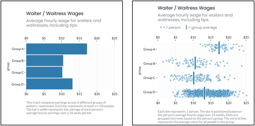
As Pieta previously highlighted, dataviz in spaces that address race / ethnicity are sensitive to “deficit framing.” That is, when it’s presented in a way that over-emphasizes differences between groups (while hiding the diversity of outcomes within groups), it promotes deficit thinking (see below) and can reinforce stereotypes about the (often minoritized) groups in focus.

In a follow up study, Eli and Cindy Xiong (of UMass’ HCI-VIS Lab) confirmed Pieta’s arguments, showing that even “neutral” data visualizations of outcome disparities can lead to deficit thinking (and therefore stereotyping) and that the way visualizations are designed can significantly impact these harmful tendencies.

Author(s): Eli Holder, Pieta Blakely

Publication Date: 2 Aug 2022

Publication Site: 3iap

“Dispersion & Disparity” Research Project Results

Link: https://3iap.com/dispersion-disparity-equity-centered-data-visualization-research-project-Wi-58RCVQNSz6ypjoIoqOQ/

Graphic:

The same dataset, visualized two different ways. The left fixates on between-group differences, which can encourage stereotyping. The right shows both between and within group differences, which may discourage viewers’ tendencies to stereotype the groups being visualized.

Excerpt:

Ignoring or deemphasizing uncertainty in dataviz can create false impressions of group homogeneity (low outcome variance). If stereotypes stem from false impressions of group homogeneity, then the way visualizations represent uncertainty (or choose to ignore it) could exacerbate these false impressions of homogeneity and mislead viewers toward stereotyping.

If this is the case, then social-outcome-disparity visualizations that hide within-group variability (e.g. a bar chart without error bars) would elicit more harmful stereotyping than visualizations that emphasize within-group variance (e.g. a jitter plot).

Author(s): Stephanie Evergreen

Publication Date: 2 Aug 2022

Publication Site: 3iap

The Ten Most Misleading Charts During Donald Trump’s Presidency

Link: https://policyviz.com/2021/02/15/the-ten-most-misleading-charts-during-donald-trumps-presidency/

Graphic:

Excerpt:

Over the course of four years as President, Donald Trump made more than 30,000 false or misleading claims, according to the Washington Post Fact Checker. It should be no surprise, then, that some of these took the form of data visualizations. Here are the top ten most misleading charts, graphs, maps, and tables from the Trump Administration over the past four years.

Author(s): Jonathan Schwabish

Publication Date: 15 February 2021

Publication Site: PolicyViz