Thinking Spreadsheet

Link: https://joelgrus.github.io/thinking-spreadsheet/

Graphic:

Excerpt:

There are many books about spreadsheets out there. Most of these books will tell you things like “How to save a file” and “How to make a graph” and “How to compute the present value of a stream of cashflows” and “How to use conjoint analysis to figure out which features you should add to the next version of your company’s widgets in order to impress senior management and get a promotion and receive a pay raise so you can purchase a bigger boat than your neighbor has.”

This book isn’t about any of those. Instead, it’s about how to Think Spreadsheet. What does that mean? Well, spreadsheets lend themselves well to solving specific types of problems in specific types of ways. They lend themselves poorly to solving other specific types of problems in other specific types of ways.

Thinking Spreadsheet entails the following:

  • Understanding how spreadsheets work, what they do well, and what they don’t do well.
  • Using the spreadsheet’s structure to intelligently organize your data.
  • Solving problems using techniques that take advantage of the spreadsheet’s strengths.
  • Building spreadsheets that are easy to understand and difficult to break.

To help you learn how to Think Spreadsheet, I’ve collected a variety of curious and often whimsical examples. Some represent problems you are likely to encounter out in the wild, others problems you’ll never encounter outside of this book. Many of them we’ll solve multiple times. That’s because in each case, the means are more interesting than the ends. You’ll never (I hope) use a spreadsheet to compute all the prime numbers less than 100. But you’ll often (I hope) find useful the techniques we’ll use to compute those prime numbers, and if you’re clever you’ll go away and apply them to all sorts of real-world problems. As with most books of this sort, you’ll really learn the most if you recreate the examples yourself and play around with them, and I strongly encourage you to do so.

Author(s): Joel Grus

Publication Date: originally in dead-tree form 2010, accessed 29 Oct 2022

Publication Site: Joel Grus github
Hacker Laws — The Hype Cycle – Amara’s Law

Link: https://github.com/dwmkerr/hacker-laws#the-hype-cycle–amaras-law

Graphic:

Excerpt:

The Hype Cycle on Wikipedia

We tend to overestimate the effect of a technology in the short run and underestimate the effect in the long run.

(Roy Amara)

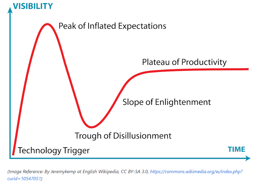
The Hype Cycle is a visual representation of the excitement and development of technology over time, originally produced by Gartner. It is best shown with a visual:

In short, this cycle suggests that there is typically a burst of excitement around new technology and its potential impact. Teams often jump into these technologies quickly, and sometimes find themselves disappointed with the results. This might be because the technology is not yet mature enough, or real-world applications are not yet fully realised. After a certain amount of time, the capabilities of the technology increase and practical opportunities to use it increase, and teams can finally become productive. Roy Amara’s quote sums this up most succinctly – “We tend to overestimate the effect of a technology in the short run and underestimate in the long run”.

Publication Date: accessed 5 June 2022

Publication Site: github

Actuarial Data Science Tutorials

Link: https://www.actuarialdatascience.org/ADS-Tutorials/

Graphic:

Excerpt:

On this page we present all the tutorials that have been prepared by the working party. We are intensively working on additional ones and we aim to have approx. 10 tutorials, covering a wide range of Data Science topics relevant for actuaries.

All tutorials consist of an article and the corresponding code. In the article, we describe the methodology and the statistical model. By providing you with the code you can easily replicate the analysis performed and test it on your own data.

Author(s): Swiss Association of Actuaries

Publication Date: accessed 20 Jan 2022

Publication Site: Actuarial Data Science

Average Annual Temperature for Select Countries and Global Scale

Link: https://github.com/resource-watch/blog-analysis/tree/master/req_016_facebook_average_surface_temperature

Description:

This file describes analysis that was done by the Resource Watch team for Facebook to be used to display increased temperatures for select countries in their newly launched Climate Science Information Center. The goal of this analysis is to calculate the average monthly and annual temperatures in numerous countries at the national and state/provincial level and globally from 1950 through 2020.

Check out the Climate Science Information Center (CSIC) for up to date information on climate data in your area from trusted sources. And go to Resource Watch to explore over 300 datasets covering topics from food, forests, water, oceans, cities, energy, climate, and society. This analysis was originally performed by Kristine Lister and was QC’d by Weiqi Zhou.

Author: Kristine Lister

Date Accessed: 12 Oct 2021

Location: github

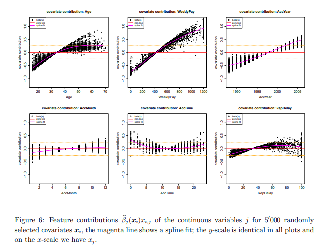
Interpretable Machine Learning: A Guide for Making Black Box Models Explainable

Link: https://christophm.github.io/interpretable-ml-book/

Graphic:

Excerpt:

Machine learning has great potential for improving products, processes and research. But computers usually do not explain their predictions which is a barrier to the adoption of machine learning. This book is about making machine learning models and their decisions interpretable.

After exploring the concepts of interpretability, you will learn about simple, interpretable models such as decision trees, decision rules and linear regression. Later chapters focus on general model-agnostic methods for interpreting black box models like feature importance and accumulated local effects and explaining individual predictions with Shapley values and LIME.

All interpretation methods are explained in depth and discussed critically. How do they work under the hood? What are their strengths and weaknesses? How can their outputs be interpreted? This book will enable you to select and correctly apply the interpretation method that is most suitable for your machine learning project.

Author(s): Christoph Molnar

Publication Date: 2021-06-14

Publication Site: github

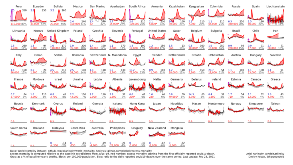
Excess mortality during the COVID-19 pandemic

Link: https://github.com/dkobak/excess-mortality

Graphic:

Excerpt:

The data are sourced from the World Mortality Dataset. Excess mortality is computed relative to the baseline obtained using linear extrapolation of the 2015–19 trend. In the figure below, gray lines are 2015–19, black line is baseline for 2020, red line is 2020, purple line is 2021. Countries are sorted by the % increase over the baseline.

Red number: excess mortality starting from the first officially reported Covid-19 death.
Gray number: excess mortality as a % of the annual baseline deaths.
Black number: excess mortality per 100,000 population.
Blue number: ratio to the daily reported Covid-19 deaths over the same period (sourced from JHU).

Author(s): Dmitry Kobak

Date Accessed: 24 February 2021

Publication Site: github

World Mortality Data Set

Link: https://github.com/akarlinsky/world_mortality

Additional Link: https://github.com/dkobak/excess-mortality

Paper: https://www.medrxiv.org/content/10.1101/2021.01.27.21250604v1

Graph:

Abstract:

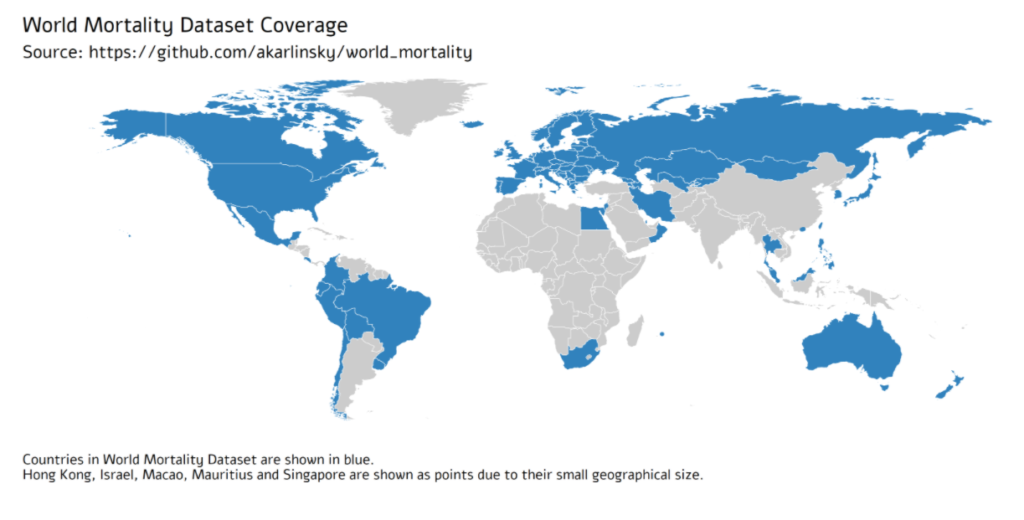
Comparing the impact of the COVID-19 pandemic between countries or across time is difficult because the reported numbers of cases and deaths can be strongly affected by testing capacity and reporting policy. Excess mortality, defined as the increase in all-cause mortality relative to the recent average, is widely considered as a more objective indicator of the COVID-19 death toll. However, there has been no central, frequently-updated repository of the all-cause mortality data across countries. To fill this gap, we have collected weekly, monthly, or quarterly all-cause mortality data from 77 countries, openly available as the regularly-updated World Mortality Dataset. We used this dataset to compute the excess mortality in each country during the COVID-19 pandemic. We found that in the worst-affected countries the annual mortality increased by over 50%, while in several other countries it decreased by over 5%, presumably due to lockdown measures decreasing the non-COVID mortality. Moreover, we found that while some countries have been reporting the COVID-19 deaths very accurately, many countries have been underreporting their COVID-19 deaths by an order of magnitude or more. Averaging across the entire dataset suggests that the world’s COVID-19 death toll may be at least 1.6 times higher than the reported number of confirmed deaths.

Authors: Ariel Karlinsky, Dmitry Kobak

Date Accessed: 3 February 2021

Publication Date: 29 January 2021

Publication Site: github