Data visualisation by hand: drawing data for your next story

Link: https://datajournalism.com/read/longreads/data-visualisation-by-hand

Graphic:
Excerpt:

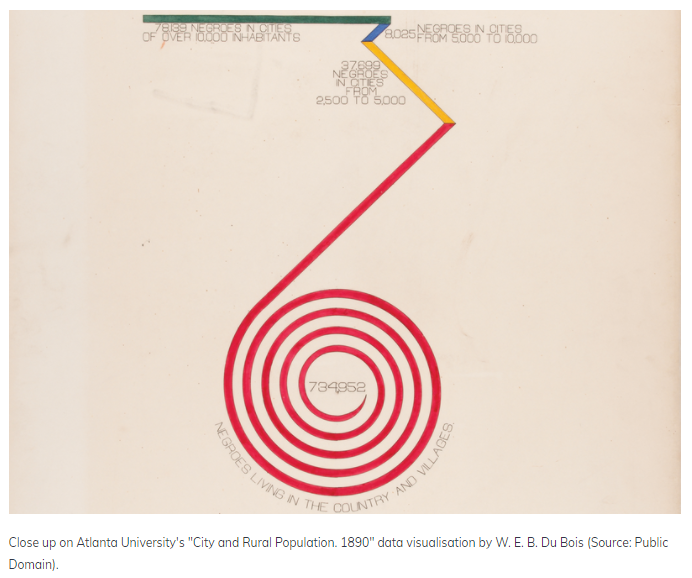
We live in a world where data visualisations are done through intricate code and graphic design. From Tableau to Datawrapper and Python and R, numerous possibilities exist for visualising compelling stories. But in the beginning, all data visualisation was done by hand. Visualisation pioneers like W. E. B. Du Bois and Florence Nightingale hand-drew their visualisations because there was simply no other way to make them.

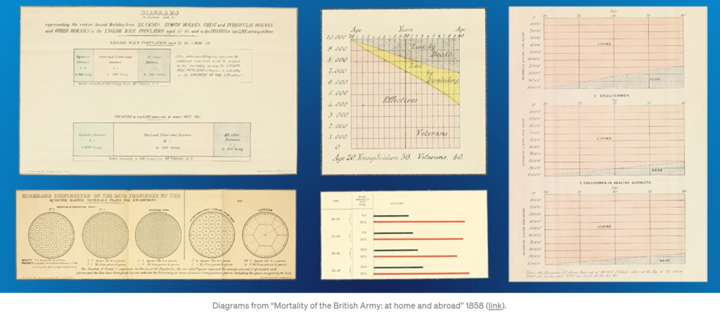
For Du Bois it was his team of black sociologists who explained institutionalised racism to the world using data visualisations, while for Nightingale it was her diagram showing the causes of mortality.

And, even as computers developed, it was often easier to visualise using analogue means. This article will explore the history of hand-drawn visualisations and the case for presenting them in this style. It will also show examples from experts who have opted for the pencil over the screen. You’ll also learn some top tips to help get you started.

Author(s): Amelia McNamara

Publication Date: 24 March 2021

Publication Site: DataJournalism.com
Florence Nightingale is a Design Hero

Link: https://medium.com/nightingale/florence-nightingale-is-a-design-hero-8bf6e5f2147

Graphic:

Excerpt:

On trips through Europe, Nightingale displayed a natural inclination to record data: distance and times traveled were neatly cataloged in her journal. She hoarded information pamphlets, especially those concerning laws, social conditions, and benevolent institutions. In a Parisian salon, Mary Clarke showed Nightingale how bold, independent, intelligent, and equal to men a woman can be.

In Egypt, Nightingale cruised the Nile and discovered ancient mysticism. Near Thebes, God called Florence Nightingale to nursing. God called me in the morning and asked me would I do good for him alone without reputation. But rich kids do not become nurses. Nursing was below Nightingale’s class. Her family disapproved.

Author(s): RJ Andrews

Publication Date: 15 July 2019

Publication Site: Nightingale at Medium

Geeking Out: Florence Nightingale, Data Visualization Pioneer – and Redoing Her Famous Graph

Link: https://marypatcampbell.substack.com/p/geeking-out-florence-nightingale

Graphic:

Excerpt:

There is a problem with the table, which a fellow actuary pointed out to me. I will explain that after I fix the graph.

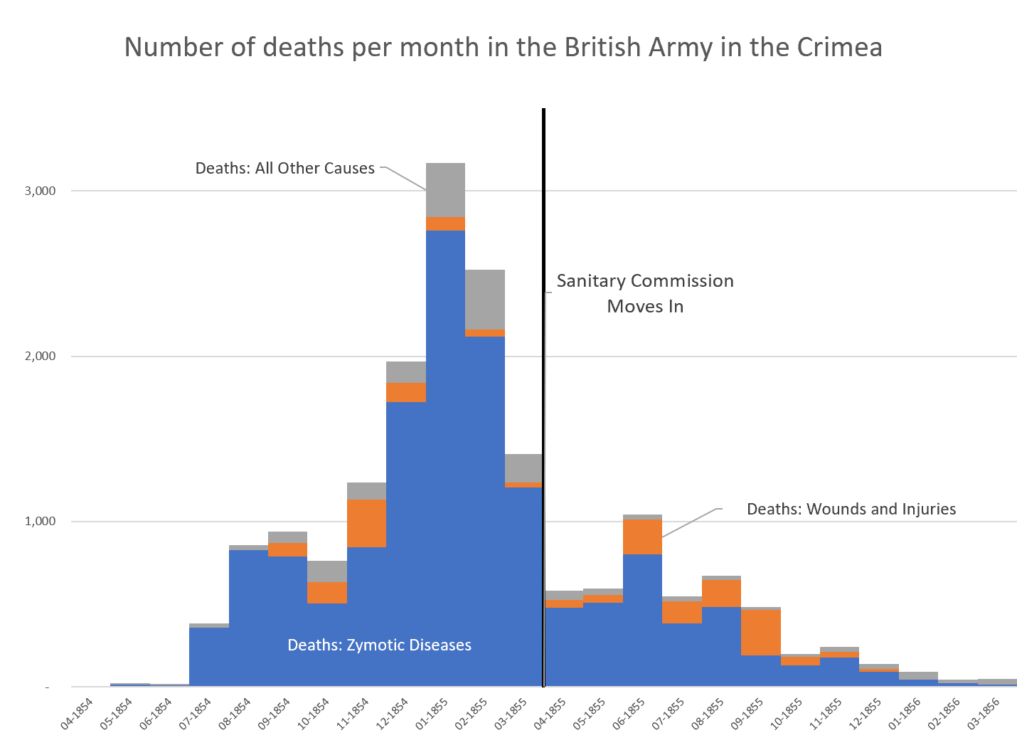
Let’s start with the simplest graph: total deaths by type (zymotic disease, wounds, and battle fatalities)

I switched up the order of items and changed my presentation for the stacked column graph version:

Author(s): Mary Pat Campbell

Publication Date: 10 March 2021

Publication Site: STUMP on Substack