Graphic:

Excerpt:
The number represented by the line could be thought of as the velocity of cases in the U.S. It tells us how fast case counts are increasing or decreasing and does a good job of showing us the magnitude of each wave of cases.
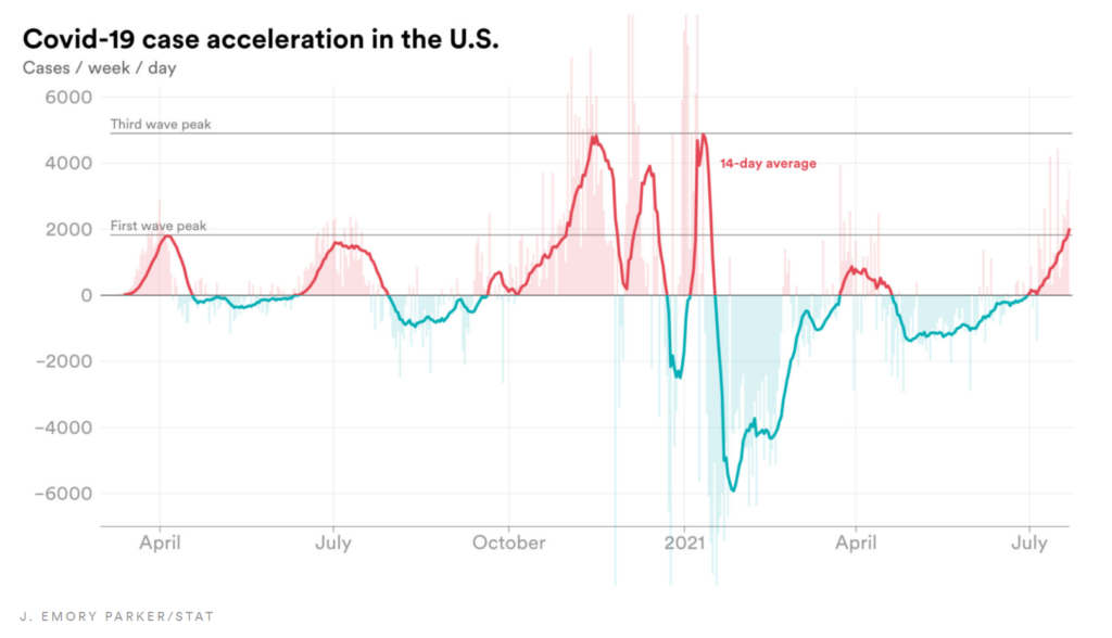
The chart, however, fails to show the rate of acceleration of cases. This is the rate at which the number of new cases is speeding up or slowing down.
As an analogy, a car’s velocity tells you how fast the car is going. Its acceleration tells you how quickly that car is speeding up.
Using Covid-19 case data compiled by the Center for Systems Science and Engineering at Johns Hopkins University and Our World in Data, combined with data from the Centers for Disease Control and Prevention, STAT was able to calculate the rate of weekly case acceleration, pictured below.
Author(s): Emory Parker
Publication Date: 26 July 2021
Publication Site: STAT News