COVID-19 Severity Prediction

Link: https://covidseverity.com//

Graphic:
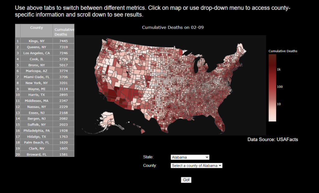
Excerpt:

The Yu Group at UC Berkeley Statistics / EECS / CCB is working to help forecast the severity of the epidemic for individual counties and hospitals in the US. We develop interpretable models (updated daily) and curate data to predict the trajectory of COVID-19-related deaths. This website provides access to those predictions, in the form of interactive visualizations. We are collaborating with Response4Life to blunt the effect of COVID-19 through the production and appropriate distribution of PPE, medical equipment, and medical personnel to healthcare facilities across the United States.

For hospital level prediction, please go to our hospitalization prediction page where one can upload data for a specific hospital and download prediction results for the given hospital. The uploaded data will only be temporarily used for prediction and will not be collected.GITHUB

Author(s): Yu Group, UC Berkeley Statistics / EECS / CCB

Accessed Date: 10 February 2021
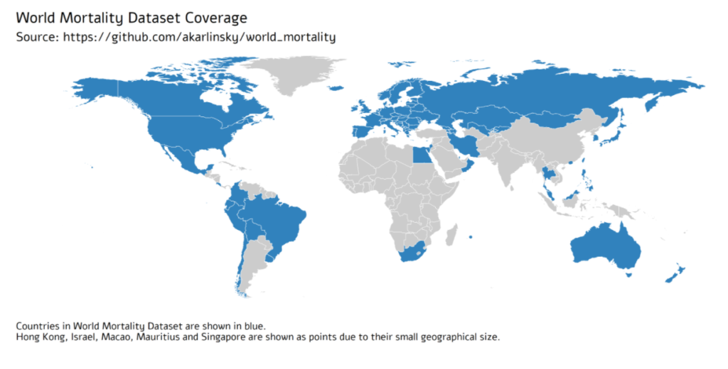
World Mortality Data Set

Link: https://github.com/akarlinsky/world_mortality

Additional Link: https://github.com/dkobak/excess-mortality

Paper: https://www.medrxiv.org/content/10.1101/2021.01.27.21250604v1

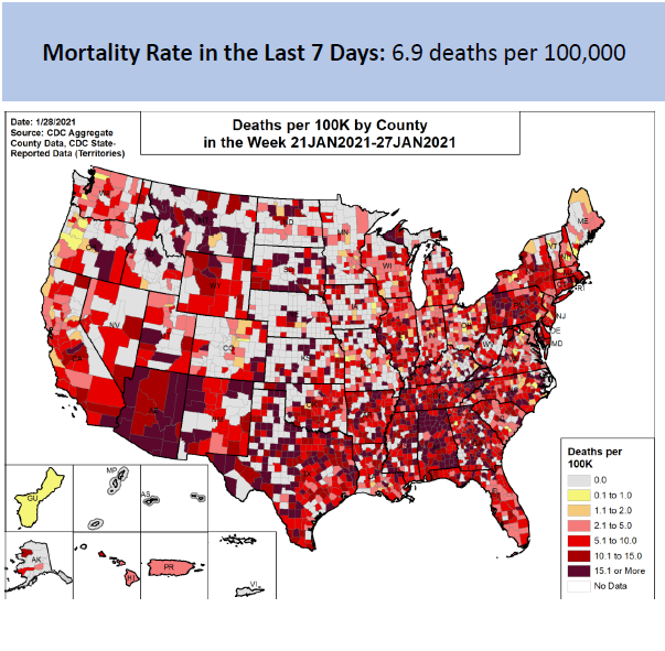
Graph:

Abstract:

Comparing the impact of the COVID-19 pandemic between countries or across time is difficult because the reported numbers of cases and deaths can be strongly affected by testing capacity and reporting policy. Excess mortality, defined as the increase in all-cause mortality relative to the recent average, is widely considered as a more objective indicator of the COVID-19 death toll. However, there has been no central, frequently-updated repository of the all-cause mortality data across countries. To fill this gap, we have collected weekly, monthly, or quarterly all-cause mortality data from 77 countries, openly available as the regularly-updated World Mortality Dataset. We used this dataset to compute the excess mortality in each country during the COVID-19 pandemic. We found that in the worst-affected countries the annual mortality increased by over 50%, while in several other countries it decreased by over 5%, presumably due to lockdown measures decreasing the non-COVID mortality. Moreover, we found that while some countries have been reporting the COVID-19 deaths very accurately, many countries have been underreporting their COVID-19 deaths by an order of magnitude or more. Averaging across the entire dataset suggests that the world’s COVID-19 death toll may be at least 1.6 times higher than the reported number of confirmed deaths.

Authors: Ariel Karlinsky, Dmitry Kobak

Date Accessed: 3 February 2021

Publication Date: 29 January 2021

Publication Site: github

NJ Retirees – Politicians

Excerpt:

Public servants often spend multiples of what their salaries will be in the jobs they seek in order to get those jobs since they have other incentives. One of those is likely the pension, even for part time employment, that comes with the job.

Though job-hopping makes it impossible to finger all the mayors or council people who game the system, here are some whose last employer was the Office of the Governor, Senate, or General Assembly who, based on data on retirees in the New Jersey Retirement System taken from the the state pension website are getting over $50,000 annually – along with some other familiar names.

Author: John Bury

Publication Date: 1 February 2021

Publication Site: burypensions

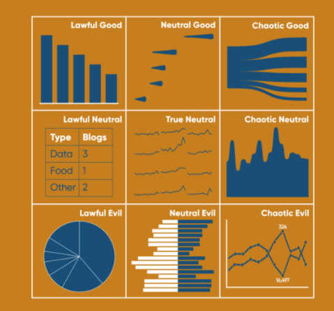
My Alignment Chart of Charts

Link: https://www.makeit-makesense.com/data/my-alignment-chart-of-charts

Graph:

Excerpt:

For this specific application, when I think of lawfulness, I am going to mainly assess the likelihood to be misused. And for good versus evil, I’ll be looking at how well they can typically help the user understand the data. 


Lawful Good: Bar Chart 

This is the best alignment you can be. In traditional use, lawful good applies to people that both follow the rules and help others. Here I’m applying it to a chart that I think is often used well and is easy to read. Name a better liked and more used chart than the bar chart – you can’t. 10/10 analysts would recommend. 

Author: Autumn Battani

Publication Date: 30 January 2021

Publication Site: Make It Make Sense

Total deaths in the UK from 2000 to 2020

Link: https://www.ons.gov.uk/aboutus/transparencyandgovernance/freedomofinformationfoi/totaldeathsintheukfrom2000to2020

YearUnited KingdomEngland and WalesEnglandWalesScotlandNorthern Ireland
2018616,014541,589505,85934,40658,50315,922
2017607,172533,253498,88233,24857,88316,036
2016597,206525,048490,79133,06656,72815,430
2015602,782529,655495,30933,19857,57915,548
2014570,341501,424468,87531,43954,23914,678
2013576,458506,790473,55232,13854,70014,968
2012569,024499,331466,77931,50254,93714,756
2011552,232484,367452,86230,42653,66114,204
2010561,666493,242461,01731,19753,96714,457
2009559,617491,348459,24131,00653,85614,413
2008579,697509,090475,76332,06655,70014,907
2007574,687504,052470,72132,14855,98614,649
2006572,224502,599470,32631,08355,09314,532
2005582,964512,993479,67832,16255,74714,224
2004584,791514,250480,71732,31756,18714,354
2003612,085539,151504,12733,81058,47214,462
2002608,045535,356500,79233,31458,10314,586
2001604,393532,498497,87833,24957,38214,513
2000610,579537,877503,02633,50157,79914,903

Date Accessed: 28 January 2021

Publication Site: Office for National Statistics, UK

NJ Retiree Update – December, 2020

Excerpt:

Based on state pension data updated through December, 2020 there are 358,277 retirees getting annualized pensions of $12,024,013.

Through December, 2019 there were 352,416 retirees getting annualized pensions of $11,675,297,749 .

There are now 4,195 retirees getting over $100,000 annually. Of those 91 are getting pensions of over $150,000 annually:

Author: John Bury

Publication Date: 26 January 2021

Publication Site: burypensions