Visualizing the American Workforce as 100 People

Link: https://www.visualcapitalist.com/american-workforce-100-people/

Graphic:
Excerpt:

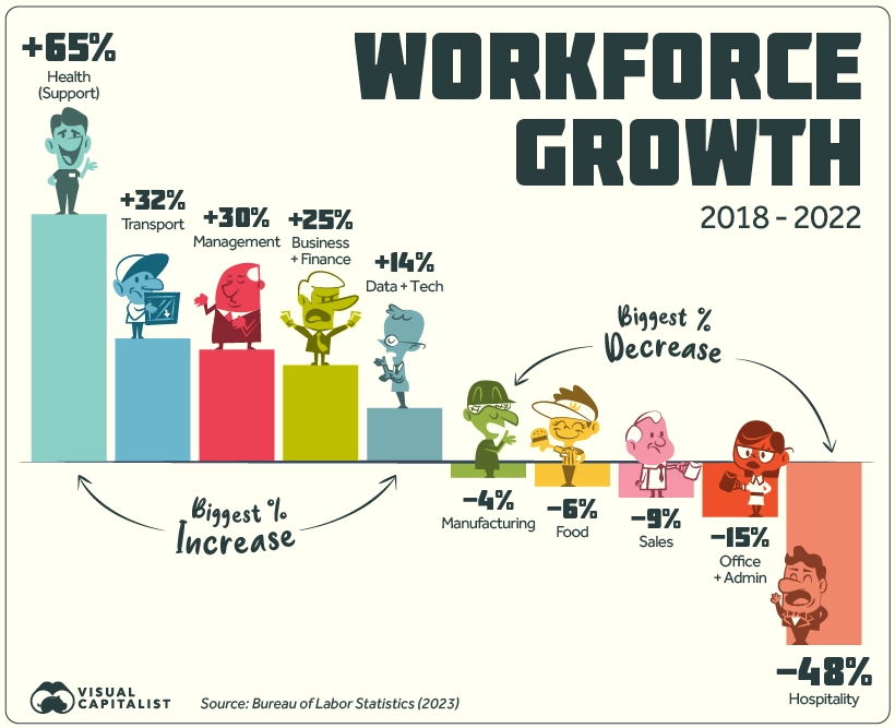
Over the last five years, the American workforce has not stayed static. Of the listed 22 groups, 13 saw growth in employment numbers, nine saw a decrease, and one stayed flat since 2018.

The top gainer by far is Health Support (medical assistants, care aides, orderlies, etc.) which grew by 65%. Looking at the timeline of growth does not paint a steady picture: employment jumped between 2018 and 2019, briefly fell in 2020, and has since risen again in 2021-2022.

Another top gainer is Transport, rising from the 4th to 3rd biggest employer, beating out Sales in 2022. Business & Finance and Management have also seen steady increases since 2018.

On the other hand Hospitality saw a staggering 48% drop in numbers, not all together surprising given the impact of the COVID-19 pandemic as well as the rise of tech companies like Airbnb.

Meanwhile, Office & Admin work saw a 15% loss in employees, even though this category is still the biggest employer in the country by a significant margin. Although jobs in this group saw steady declines from 2018-2021, it registered a slight uptick in workers between 2021 and 2022.

Author(s): Pallavi Rao

Publication Date: 15 May 2023

Publication Site: Visual Capitalist
Consumer Price Index, 1913-

Link: https://www.minneapolisfed.org/about-us/monetary-policy/inflation-calculator/consumer-price-index-1913-

Excerpt:

The U.S. Bureau of Labor Statistics (BLS) began collecting family expenditure data in 1917 and published its first price indexes for select cities in 1919. In 1921, the BLS published a national consumer price index (CPI), including estimates of the CPI back to 1913. The data and methods starting in 1913 are considered generally compatible through the present day; however, the Minneapolis Fed maintains a separate historical table that includes estimates prior to 1913.

The data below use 1983 as the index (1983=100). This chart uses data from the sole measure of CPI available until 1978, after which it reflects the CPI for all urban consumers (CPI-U). The current year’s inflation figures reflect the most recent quarterly data.

You can use the Minneapolis Fed’s inflation calculator to instantly compare the buying power of past and present dollars. However, you can also use the Annual Average CPI numbers below (center column) to make manual calculations. To find out how much a price in Year 1 would be in Year 2 dollars:

Publication Date: Date Accessed 10 June 2022

Publication Site: Minneapolis Federal Reserve Bank

How the Inflation Rate Is Measured: 477 Government Workers at Grocery Stores

Link: https://www.wsj.com/articles/inflation-bls-price-checkers-who-determine-cpi-11652132333?page=1

Excerpt:

Ms. Mascitis, 50, who has been working as a BLS price checker since 2013, describes her job as “a treasure hunt.”

She set out on her route one day in April with a list of items to price. First stop: a locally owned auto-repair shop in an up-and-coming part of Philadelphia, where she is to record the total cost for a rear-brake job, wheel-bearing hull assembly replacement and full brake replacement.

The mechanic tells her about the rising costs of running the shop. He says he will have to move his office to a less-expensive part of town. He says some customers are holding off on fixing their cars and taking public transit because of high repair costs.

“It’s a mess,” she agrees.

After 10 minutes, the mechanic calls his parts supplier to find out the most up-to-date material costs.

“And is sales tax on materials and labor still 8%?” Ms. Mascitis asks. Yes, the mechanic confirms.

…..

“We have very strict data-collection rules. Someone running a store isn’t trained in CPI’s data-collection rules,” says Ms. Greene, who supervises Ms. Mascitis and 65 price checkers in a region that includes New Jersey, Pennsylvania, Delaware, Maryland, Washington, D.C., Virginia and West Virginia. She adds that it would be a burden on stores to expect them to do what CPI does. “They would say this is good enough, and good enough is not usually good enough for us.”

Author(s): Rachel Wolfe

Publication Date: 10 May 2022

Publication Site: WSJ

Public Pension Systems Pared Costs and Assumptions in 2021, NCPERS Study Finds

Link:https://www.businesswire.com/news/home/20220202005695/en/Public-Pension-Systems-Pared-Costs-and-Assumptions-in-2021-NCPERS-Study-Finds

Excerpt:

Pension systems said earnings on investments accounted for 68% of overall pension revenues in their most recent fiscal year. Employer contributions made up 23% of revenues, and employee contributions totaled 8%.

The Covid-19 pandemic accelerated efforts by public pension systems to expand their communications capabilities. In all, 78% offered live web conferences to members during 2021, up from 54% a year earlier.

Pension funds that participated in the survey in 2020 and 2021 reported that their funded levels rose to 72.3%, from 71.7%. Overall, pension funds reported a funded level of 74.7% for 2021. While funded levels are not as important to pensions’ sustainability as steady contributions are, the trend is positive.

The inflation assumption for the funds’ most recent fiscal year remained steady at 2.7%. These assumptions were in place in the midst of an acceleration in the rate of inflation, which reached 7% at the end of 2021, from 1.4% a year earlier, as reported by the Bureau of Labor Statistics.

Author(s): NCPERS

Publication Date: 2 Feb 2022

Publication Site: Businesswire

Who’s Quitting Their Jobs? New Data Show Some Workers Are More Likely Than Others

Link:https://www.wsj.com/articles/as-american-workers-leave-jobs-in-record-numbers-a-closer-look-at-who-is-quitting-11636894801

Excerpt:

Workers resigned from a record 4.4 million jobs in September, according to Labor Department data, and new surveys show that low-wage workers, employees of color and women outside the management ranks are those most likely to change roles. The findings signal that turnover isn’t evenly spread across the U.S. workforce even as employers across industries struggle to fill a variety of roles.

The overall percentage of people considering leaving their jobs — about three in 10, according to research by consulting firm Mercer LLC — is fairly consistent with historical trends. But sentiment varies across demographics and occupations. While front-line and low-wage positions typically see high rates of turnover, for example, employees in those roles are especially likely to leave now, Mercer found in a survey of 2,000 U.S. workers conducted in August.

….

Nearly half of low-wage and front-line workers surveyed said their pay and benefits were insufficient while 41% said they felt burned out from demanding workloads. Some 35% of Black employees and 40% of Asian employees said they were considering leaving, compared with 26% of white employees.

Author(s): Kathryn Dill

Publication Date: 14 Nov 2021

Publication Site: WSJ

Details in BLS report suggest that the ‘gender earnings gap’ can be explained by age, marital status, children, hours worked, etc.

Link: https://www.aei.org/carpe-diem/details-in-bls-report-suggest-that-the-gender-earnings-gap-can-be-explained-by-age-marital-status-children-hours-worked-etc/

Graphic:

Excerpt:

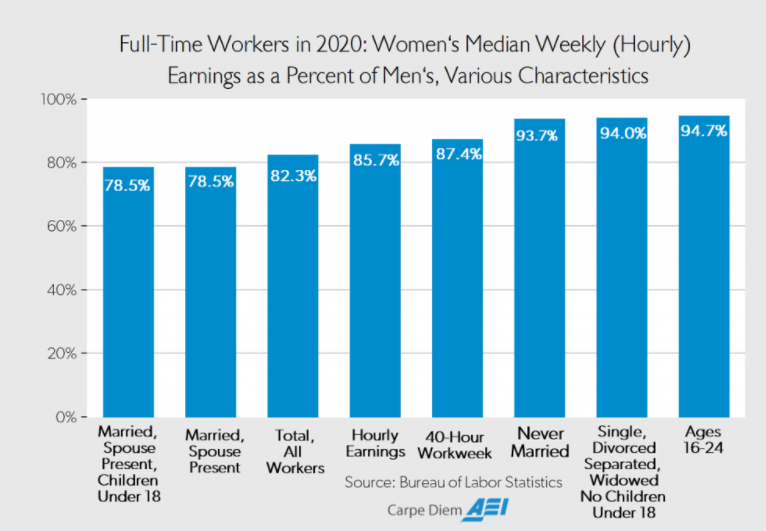
Let’s investigate the claim that the gender pay gap is a result of discrimination by looking at some of the data on wages and hours worked by gender and by marital status and age in the BLS report for 2020:

….

Comment: Because men work more hours on average than women, some of the raw earnings gap naturally disappears just by simply controlling for the number of hours worked per week, an important factor not even mentioned by groups like the National Committee on Pay Equity. For example, women earned 82.3% of median male earnings for all workers working 35 hours per week or more in 2020, for a raw, unadjusted pay gap of 17.7% for all full-time workers. But for those workers with a 40-hour workweek (more than three-quarters of all full-time female workers), women earned 87.4% of median male earnings, for a smaller pay gap of only 12.6% (see chart and Table 1). Therefore, once we control only for one variable – hours worked – and compare men and women both working 40-hours per week in 2020, almost one-third (5.1 percentage points) of the raw 17.7% pay gap reported by the BLS for full-time workers disappears.

….

Bottom Line: When the BLS reports that women working full-time in 2020 earned 82.3% of what men earned working full-time, that is very much different from saying that women earned 82.3% of what men earned for doing exactly the same work while working the exact same number of hours in the same occupation, with exactly the same educational background and exactly the same years of continuous, uninterrupted work experience, and with exactly the same marital and family (e.g., number of children) status. As shown above, once we start controlling individually for the many relevant factors that affect earnings, e.g., hours worked, age, marital status, and having children, most of the raw earnings differential disappears. In a more comprehensive study that controlled for all of the relevant variables simultaneously, we would likely find that those variables would account for nearly 100% of the unadjusted, raw earnings differential of 17.7% for women’s earnings compared to men as reported by the BLS. Discrimination, to the extent that it does exist, would likely account for a very small portion of the raw 17.7% gender earnings gap.

Author(s): Mark J. Perry

Publication Date: 22 Oct 2021

Publication Site: AEI

Americans Should Quit Their Jobs More Often

Link: https://www.bloomberg.com/opinion/articles/2021-07-07/americans-should-quit-their-jobs-more-often

Excerpt:

The pandemic and the work-from-home environment it spawned also led many economists to speculate that workers would become better adapted to technology, more efficient and strike a healthier balance between work and lifeThis, in turn, would leave them more mobile. A Microsoft Corp. workplace trends survey found that 40% of Americans are considering leaving their jobs this year. And many are doing just that, with 2.5% of the employed quitting their jobs in May, according to the Bureau of Labor Statistics’  Job Opening and Labor Turnover Survey. Although that’s down from the record 2.8% in April, it’s still higher than any other point since at least before 2001. Plus, consider that the quit rate was only 2.3% in 2019 when unemployment was just 3.6%, compared with 5.8% this May.

Author(s): Allison Schrager

Publication Date: 7 July 2021

Publication Site: Bloomberg

A Made-in-Washington Inflation Spike

Link: https://www.wsj.com/articles/a-made-in-washington-inflation-spike-11623362377?mod=opinion_lead_pos1

Excerpt:

The Labor Department’s consumer price index surged 5% year-over-year in May, the largest increase since August 2008 when oil was $140 a barrel. But don’t worry, Americans. The Federal Reserve says inflation is “transitory” and that it has the tools to control prices if they start to spiral out of control. Let us pray.

Nobody should be surprised that prices are increasing everywhere from the grocery store to the car dealership. Demand is soaring as the pandemic recedes while supply constraints linger, especially in labor and transportation. As always, this is a price shock largely made by government. Congress has shovelled out trillions of dollars in transfer payments over the past year, and the Fed has rates at zero while the economy may be growing at a 10% annual rate.

The personal savings rate in April was 14.9%, double what it was before the pandemic. Record low mortgage interest rates have enabled homeowners to lower their monthly payments to burn more cash on other things. Congress’s $300 unemployment bonus and other welfare payments for not working have contributed to an enormous worker shortage, which is magnifying supply shortages.

All of this is showing up in higher prices. Over the last 12 months, core inflation excluding food and energy is up 3.8% and much more for used cars (29.7%), airline fares (24.1%), jewelry (14.7%), bikes (10.1%) and footwear (7.1%). Commodity prices from oil to copper to lumber have surged. Higher lumber prices are adding $36,000 to the price of a new home.

Author(s): Editorial Board

Publication Date: 10 June 2021

Publication Site: WSJ

The Social Security shell game

Link: http://exclusive.multibriefs.com/content/the-social-security-shell-game/civil-government

Excerpt:

According to The Senior Citizens League, the sleight of hand behind it is a formula for calculating the Cost of Living Adjustment (COLA) that has robbed seniors of 33% of their buying power since 2010.

Since then, annual COLA increases have averaged a meager 1.375%. That means the average recipient has received a COLA increase of less than $20 a month. For many, the con job is even more vexing because much of that gain is taken back with increases in Medicare premiums.

These annual COLA adjustments are based by the U.S. Bureau of Labor Statistics (BLS) on a formula that uses the Consumer Price Index for All Urban Wage Earners and Clerical Workers — a lengthy descriptor that’s usually abbreviated as CPI-W. Therein lies the problem — this index does not accurately reflect the rising costs that most affect seniors — such as medical care and drugs, food/staples and rent. Even the most modest estimates suggest these costs are increasing at a rate of somewhere between 5% and 10% annually.

Author(s): Dave G. Houser

Publication Date: 5 March 2021

Publication Site: Multibriefs

The Gender Gap in Pandemic Job Losses Has Been Wildly Exaggerated

Excerpt:


“Labor force participation—defined as all civilians working full or part time, as well as those who are unemployed but looking for work—fell dramatically for both genders between March and April 2020,” noted Gallup. In April 2020, men’s labor force participation was at 97.8 percent of its February 2020 level and women’s labor force participation was 96.9 percent of its February 2020 level—a gender gap of just 0.9* percentage points.

By February 2021, labor force participation for both sexes had ticked back up somewhat. And while women were still seeing a less full recovery, the gap was again less than one percentage point. Compared to February 2020, men’s February 2021 labor force participation was 2.2 percent smaller and women’s was 3.1 percent smaller.

That’s not nothing—“the gap in labor force changes amounts to roughly 493,000 more women than men being absent from the labor force since the pandemic began,” Gallup pointed out in early March. But it’s also not evidence that women have been uniquely devastated by pandemic-related job losses, especially when—contra previous economic downturns—many of the circumstances that initially created the job losses will remedy quickly as life returns to a more normal pace.

Author(s): Elizabeth Nolan Brown

Publication Date: 11 May 2021

Publication Site: Reason

Characteristics of minimum wage workers, 2020

Link: https://www.bls.gov/opub/reports/minimum-wage/2020/home.htm

Excerpt:

Age. Minimum wage workers tend to be young. Although workers under age 25 represented just under one-fifth of hourly paid workers, they made up 48 percent of those paid the federal minimum wage or less. Among employed teenagers (ages 16 to 19) paid by the hour, about 5 percent earned the minimum wage or less, compared with 1 percent of workers age 25 and older. (See tables 1 and 7.)

Publication Date: February 2021

Publication Site: Bureau of Labor Statistics

What does the unemployment rate measure?

Graphic:

Excerpt:

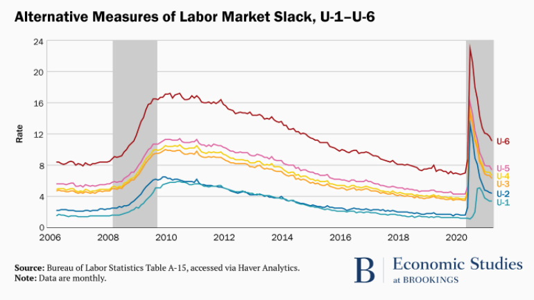
The BLS releases six measures of labor market slack in the monthly jobs report. These include the official unemployment rate (U-3), discussed above, as well as more narrow definitions, called U-1 and U-2, which respectively include only those unemployed at least 15 weeks (the long-term unemployed) or for less than a month (the short-term unemployed). The BLS also publishes broader definitions of slack. The U-6 rate, for instance, counts all those who are technically unemployed plus those are who are working part-time but would prefer full time work, and those “marginally attached to the labor force,” that is, people who say they want either a full-time or part-time job, have not looked for work in the most recent four weeks, but have looked for a job sometime in the past 12 months. When adults classified as “marginally attached” report that they did not recently seek work because they do not believe jobs are available for them, they are classified as “discouraged workers.” The U-4 counts the unemployed and discouraged workers, while U-5 adds in other marginally attached workers. In January, the broadest of these measures, U-6, stood at 11.1 percent, 4.8 percentage points higher than the official unemployment rate.

Author(s): Stephanie Aaronson

Publication Date: 18 February 2021

Publication Site: Brookings