Fundamentals of Data Visualization

Link: https://clauswilke.com/dataviz/

Graphic:
Excerpt:

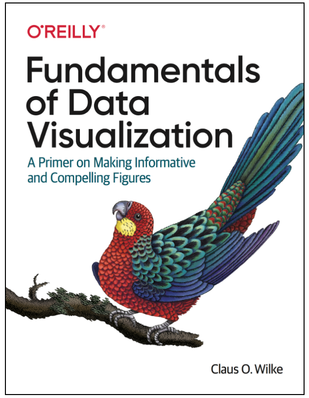
This is the website for the book “Fundamentals of Data Visualization,” published by O’Reilly Media, Inc. The website contains the complete author manuscript before final copy-editing and other quality control. If you would like to order an official hardcopy or ebook, you can do so at various resellers, including Amazon, Barnes and Noble, Google Play, or Powells.

The book is meant as a guide to making visualizations that accurately reflect the data, tell a story, and look professional. It has grown out of my experience of working with students and postdocs in my laboratory on thousands of data visualizations. Over the years, I have noticed that the same issues arise over and over. I have attempted to collect my accumulated knowledge from these interactions in the form of this book.

Author(s): Claus O. Wilke

Publication Date: accessed 20 May 2022

Publication Site: Claus Wilke’s site
The Science of Visual Data Communication: What Works

Link: https://journals.sagepub.com/stoken/default+domain/10.1177%2F15291006211051956-FREE/full#.YbpbbYlu2Xw.twitter

doi: https://doi.org/10.1177/15291006211051956

Graphic:

image

Excerpt:

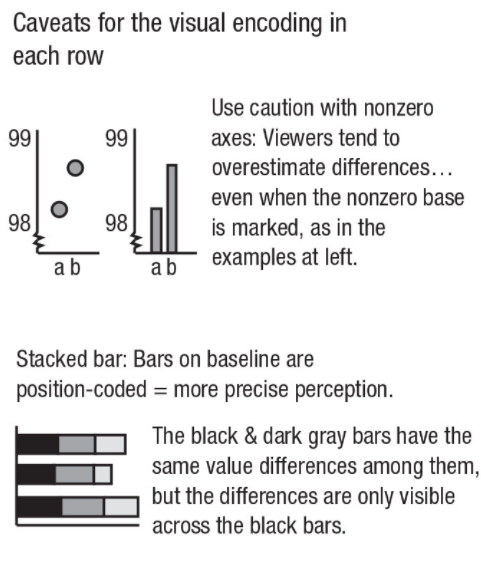
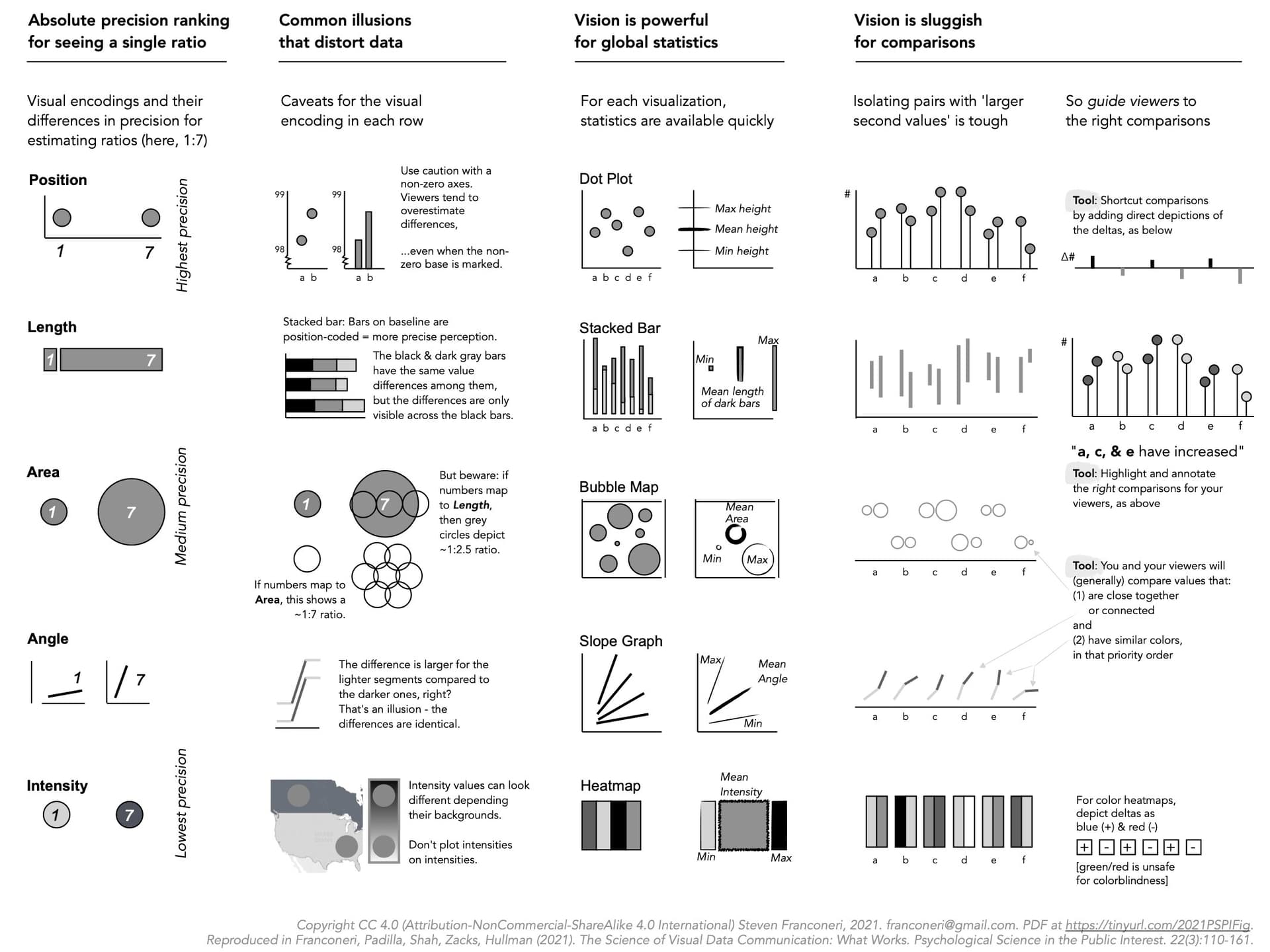
Effectively designed data visualizations allow viewers to use their powerful visual systems to understand patterns in data across science, education, health, and public policy. But ineffectively designed visualizations can cause confusion, misunderstanding, or even distrust—especially among viewers with low graphical literacy. We review research-backed guidelines for creating effective and intuitive visualizations oriented toward communicating data to students, coworkers, and the general public. We describe how the visual system can quickly extract broad statistics from a display, whereas poorly designed displays can lead to misperceptions and illusions. Extracting global statistics is fast, but comparing between subsets of values is slow. Effective graphics avoid taxing working memory, guide attention, and respect familiar conventions. Data visualizations can play a critical role in teaching and communication, provided that designers tailor those visualizations to their audience.

Author(s):
Steven L. Franconeri, Lace M. Padilla, Priti Shah, Jeffrey M. Zacks, Jessica Hullman

Publication Date: 15 Dec 2021

Publication Site: SAGE Journals

Several Ways to Improve Your Use of Excel for Actuarial Production

Link: https://www.soa.org/sections/small-insurance/small-insurance-newsletter/2021/june/stn-2021-06-mathys/

Graphic:

Excerpt:

Create a Consistent Structure for Calculations

When spreadsheets are created ad-hoc, the usage of time steps tends to be inconsistent: advancing by rows in one sheet, columns in another, and even a mix of the two in the same sheet. Sometimes steps will be weeks, other times months, quarters, or years. This is confusing for users and reviewers, leads to low trust, increases the time for updates and audits, and adds to the risks of the spreadsheet.

A better way is to make all calculations follow a consistent layout, either across rows or columns, and use that layout for all calculations, regardless if it requires a few more rows or columns. For example, one way to make calculations consistent is with time steps going across the columns and each individual calculation going down the rows:

Author(s): Stephan Mathys

Publication Date: June 2021

Publication Site: Small Talk at the Society of Actuaries

Graphing the pandemic

Link: https://www.axios.com/graphing-the-pandemic-6b62e35a-8481-4287-bcab-70d4b2fc2091.html

Graphic:

Excerpt:

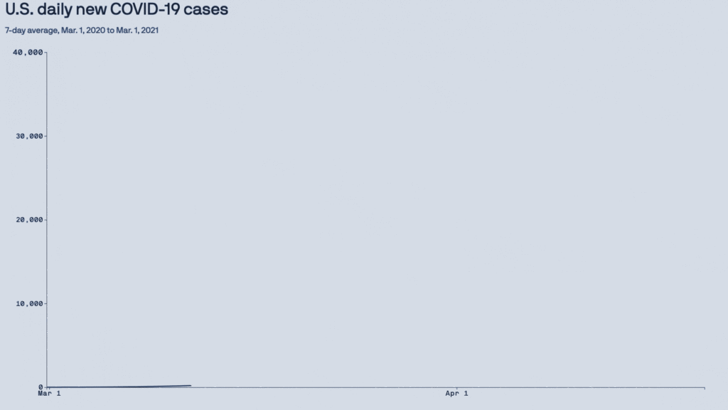
2020: The year the y-axis broke

Why it matters: Changes that typically take months or years to show up on a trend line started happening in weeks — resulting in a year of numerical outliers that will be breaking the axis for decades to come.

The result was two-fold:

Y-axes need to be continually adjusted to accommodate ever-higher numbers.

Longer term, there’s now a year of graphical outliers that future charts will have to account for.

Author(s): Mike Allen

Publication Date: 13 March 2021

Publication Site: Axios

five questions for better data communications

Link: https://www.storytellingwithdata.com/blog/2021/1/10/lets-improve-this-graph-yt9xj

Graphic:

Excerpt:

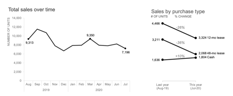
Although we don’t have the full context behind this example, let’s assume that the audience is a new senior product manager developing next year’s promotional strategy and needs to understand recent changes in the marketplace. I’ll use the Big Idea worksheet to form my single-sentence main message:

To offset a 24% sales decline due to COVID-19 and increase market share next year, consider how customers are opting for different purchase types as we form our new promotional strategy.

The action my audience needs to take is to use their newfound understanding of shifting purchase types to develop future promotional strategies. Having identified the next step, I can now choose which graph(s) will best drive this discussion. I’ll opt for the line graph to show the historical total sales decline, paired with the slopegraph to emphasize the shift in purchase types:

Author(s): Elizabeth Ricks

Publication Date: 8 March 2021

Publication Site: storytelling with data

Three Things You Can do to Make Your Data Tables More Visual

Link: https://policyviz.com/2021/03/02/three-things-you-can-do-to-make-your-data-tables-more-visual/

Graphic:

Excerpt:

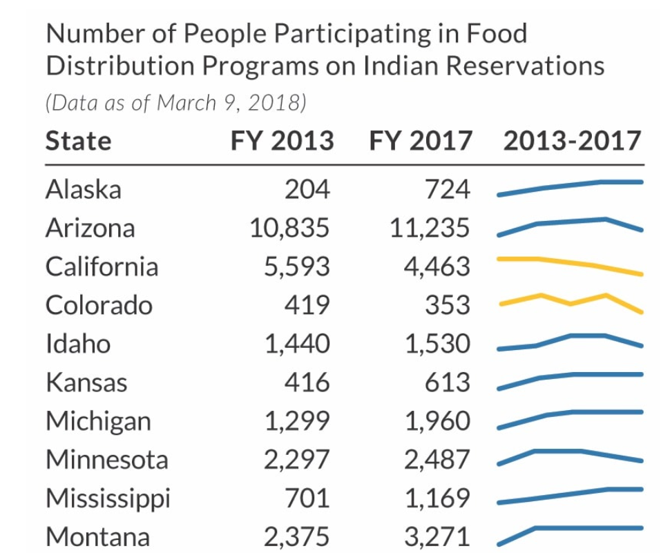
One last option is to add sparklines. Sparklines are small line charts that are typically used in data-rich tables, often at the end of a row or column. The purpose of sparklines is not necessarily to help the reader find specific values but instead to show general patterns and trends. Here, the sparklines show all five years of data, which allows us to omit three columns of numbers, lightening and simplifying the table. This approach lets us show the full time series in the sparklines while just showing the two endpoints in the table cells.

Author(s): Jon Schwabish

Publication Date: 2 March 2021

Publication Site: PolicyViz

Three ways to make your charts more accessible

Link: https://flourish.studio/2021/03/01/accessible-chart-design/

Graphic:

Excerpt:

Where possible, use colors that are bold and clear enough for people to see both text and graphical elements, like lines and points. The Web Content Accessibility Guidelines (WCAG) suggest meeting the WCAG AA requirements – something that is required by law for public bodies in several countries.

To check if your color (and font size) choices are AA accessible you can use a contrast checker website. Here you can check if there is enough contrast between the foreground and background colour for someone with a certain level of impaired vision to be able to see your data or text.

Author(s): Lyndsey Pereira-Brereton, Luisa Bider

Publication Date: 1 March 2021

Publication Site: Flourish

Data visualization guidelines and a case study

Link: http://lenkiefer.com/2021/02/26/data-visualization-guidelines-and-a-case-study/

Graphic:

Excerpt:

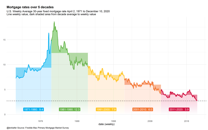
Yesterday I gave a virtual lecture on data visualization at GMU. Here I’m posting the slides I used for that talk and including my discussion notes for the portion of the talk where I discussed guidelines for data visualization.

At the beginning of the talk I spoke a bit about data visualization guidelines. I framed this part of my talk around Jon Schwabish’s five guidelines from his new book Better Data Visualizations see (on Amazon) and here for a blog summary.

I then went over some charts I’ve used recently in talks I’ve given and discussed how I used (or didn’t use) the guidelines in that chart.

Author(s): Len Kiefer

Publication Date: 26 February 2021

Publication Site: LenKiefer.com