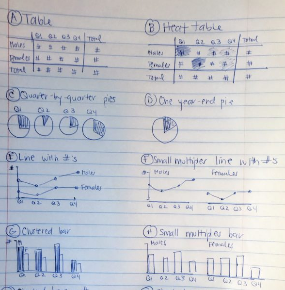
Graphic:

Excerpt:
Once I’ve selected lots of individual graphs to use, I often need to arrange them together on a page or screen.
For example, if I’m designing an infographic, the one-page summary might involve three, four, or five individual graphs.
Or, if I’m designing a dashboard, the screen might involve three, four, or five individual graphs.
I need to decide which graph should be displayed first, second, or third. Is there a natural sequence?
I also need to decide which graphs “go together.” Is there a natural grouping? A categorization? Similar graphs should be next to each other on the infographic or dashboard.
I use a pen and paper to sketch what that page could look like.
Author(s): Ann K. Emery
Publication Date: 23 February 2021
Publication Site: Depict Data Studio