The life experience of British people born between the years 1925 and 1934 has long had demographers and insurance companies scratching their heads.
For reasons which remain unclear, individuals within this slice of the UK population have been living longer and healthier lives than groups both older and younger.
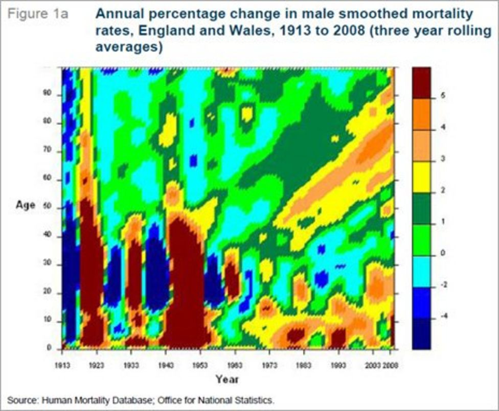
One tool used to track the golden cohort is a heat chart which, in this case, looks at annual mortality improvements for men and women. It takes a bit of explaining, but the diagrams reflect the social history of Britain over the last century or so.
Starting with men (Figure 1a), the most obvious feature of the heat chart are the vertical bands of blue and brown in the bottom left corner. Blue represents worsening mortality and brown improving, so the blue slice closest furthest to the left is the cohort decimated by World War I and the influenza pandemic.
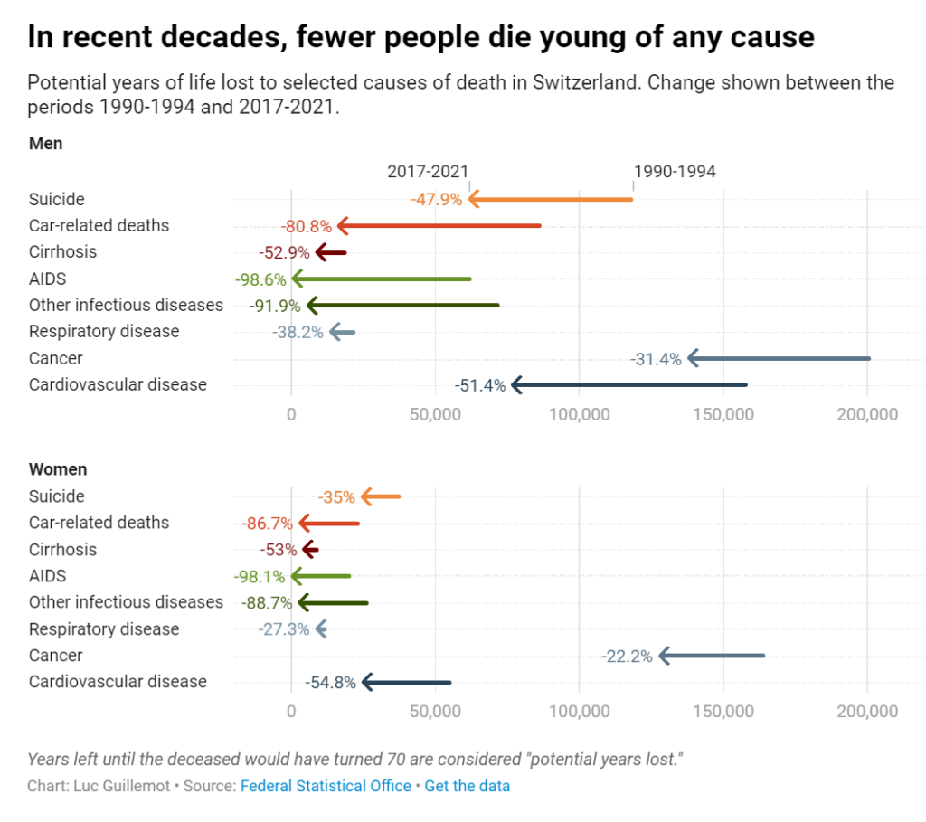
Looking at the evolution of premature deaths, we can celebrate the progress made in medical research. Years lost to infectious diseases like tuberculosis have reduced dramatically, and deaths due to AIDS in particular are nowadays close to zero, a drastic decline since the height of the pandemic in the 1990s. Cancer and cardiovascular diseases have followed a similar path, though they still cause a high number of premature deaths. We can observe that years lost to suicide before age 70 have also declined significantly. In a country where assisted suicide is legal, there is maybe something empowering in the prospect of dying healthy of old age. Years lost to alcoholism and car accidents have also declined — it may be that prevention and overall security have reduced these types of more behavioral deaths.
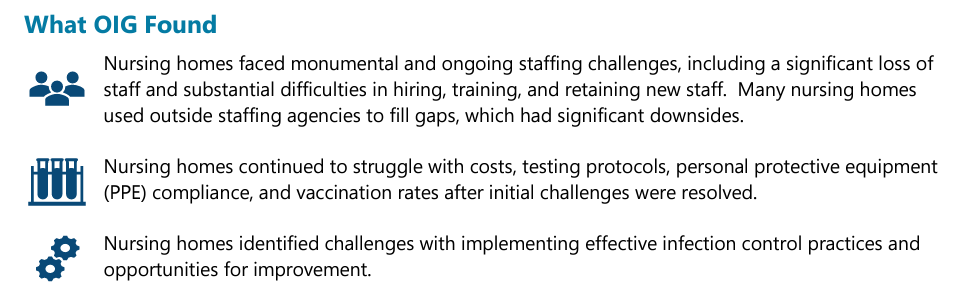
Although the pandemic has ended, staffing shortages and employee burnout still plague U.S. nursing homes, a new government report finds.
But the problems didn’t end there: The report, issued Thursday by the Inspector General’s Office at the U.S. Department of Health and Human Services, showed that infection-control procedures were still sorely lacking at many facilities.
Not only that, COVID-19 booster vaccination rates remain far lower than they should be, with only 38% of residents and 15% of staff up-to-date on their shots, according to a recent KFF report.
The overall mortality rate in nursing homes rose 32 percent in 2020. The pandemic had far-reaching implications for all nursing home beneficiaries, beyond those who had or likely had COVID-19. Among all Medicare beneficiaries in nursing homes, 22.5 percent died in 2020, which is an increase of one-third from 2019 when 17.0 percent of Medicare beneficiaries in nursing homes died. This 32-percent increase amounts to 169,291 more deaths in 2020 than if the mortality rate had remained the same as in 2019. Each month of 2020 had a higher mortality rate than the corresponding month a year earlier.
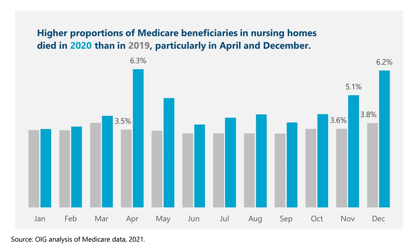
Almost 1,000 more beneficiaries died per day in April 2020 than in the previous year. In April 2020 alone, a total of 81,484 Medicare beneficiaries in nursing homes died. This is almost 30,000 more deaths—an average of about 1,000 per day—compared to the previous year. This increase in number occurred even though the nursing home population was smaller in April 2020. Overall, Medicare beneficiaries in nursing homes were almost twice as likely to die in April 2020 than in April 2019. In April 2020, 6.3 percent of all Medicare beneficiaries in nursing homes died, whereas 3.5 percent died in April 2019.
The mortality rates also rose at the end of 2020. In November, 5.1 percent of all Medicare beneficiaries in nursing homes died, and in December that increased to 6.2 percent. Again, these rates are markedly higher than the previous year. In November 2019, 3.6 percent of all Medicare beneficiaries in nursing homes died, and, in December 2019, 3.8 percent did.
Author(s): Jenell Clarke-Whyte and team
Publication Date: June 2021
Publication Site: Office of Inspector General, HHS
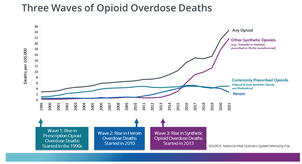
The United States is knee-deep in what some experts call the opioid epidemic’s “fourth wave,” which is not only placing drug users at greater risk but is also complicating efforts to address the nation’s drug problem.
These waves, according to a report out today from Millennium Health, began with the crisis in prescription opioid use, followed by a significant jump in heroin use, then an increase in the use of synthetic opioids like fentanyl.
The latest wave involves using multiple substances at the same time, combining fentanyl mainly with either methamphetamine or cocaine, the report found. “And I’ve yet to see a peak,” said one of the co-authors, Eric Dawson, vice president of clinical affairs at Millennium Health, a specialty laboratory that provides drug testing services to monitor use of prescription medications and illicit drugs.
The report, which takes a deep dive into the nation’s drug trends and breaks usage patterns down by region, is based on 4.1 million urine samples collected from January 2013 to December 2023 from people receiving some kind of drug addiction care.
Its findings offer staggering statistics and insights. Its major finding: how common polysubstance use has become. According to the report, an overwhelming majority of fentanyl-positive urine samples — nearly 93% — contained additional substances. “And that is huge,” said Nora Volkow, director of the National Institute on Drug Abuse at the National Institutes of Health.
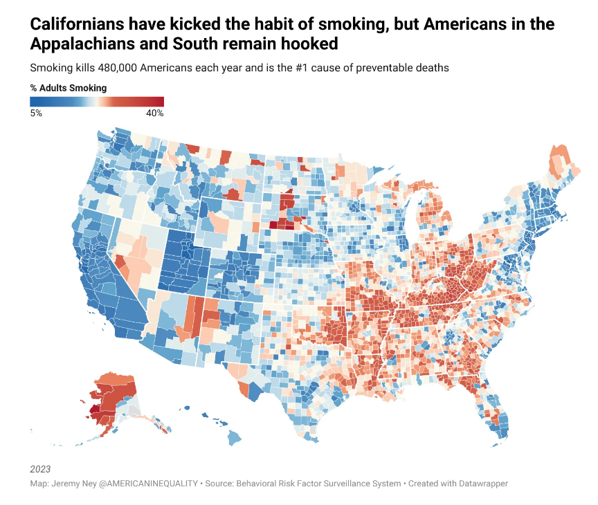
South Dakota is home to 3 of the 5 counties with the highest percent of cigarette smokers. We’ve written about one of those counties, Oglala Lakota County, severaltimes before as it has the lowest life expectancy of any county in the US (residents die at 67 on average), and median income is $30,347. Meanwhile, Utah is home to 6 of the 10 counties with the lowest percent of cigarette smokers. American Inequality has coveredseveral of these counties before. For example, Summit County has the highest life expectancy of any county in the US (residents die at 87 on average), and median income is 2.5x higher than in Oglala.
Cigarette smoking is 50% higher than in the following 12 states compared to the rest of the nation: Alabama, Arkansas, Indiana, Kentucky, Louisiana, Michigan, Mississippi, Missouri, Ohio, Oklahoma, Tennessee and West Virginia. An average smoker in these 12 states goes through about 53 packs in one year, compared with an average of 29 packs in the rest of the US. Life expectancy is 3 years lower in these states compared to the national average.
In 1998, California became the first state to implement a smoke free law prohibiting smoking in all indoor areas of bars and restaurants, as well as in most indoor workplaces. As we can see from the map above, California now has one of the lowest percent of adults smoking in the country.
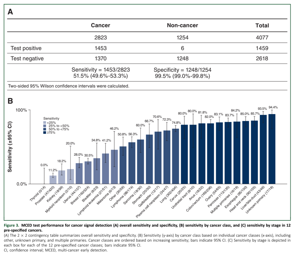
Looking a bit more closely you see why Grail’s test is actually useless, or dangerous, or both. Let’s start with the sensitivity of the test. For a cancer screening test to work, it must find disease before it has caused symptoms — when it is in an early or premalignant stage. Say what you want about lung cancer screening, mammography, PSA, and colonoscopy (I’m talking to you Drs. M and P) but at least they look for, and succeed at finding, early stage/premalignant disease. Here is the sensitivity of the Galleri test by stage: stage 1, 16.8%; stage 2, 40.4%; stage 3, 77%; stage 4, 90.1%.
The test is nearly worthless at finding stage 1 disease, the stage we would like to find with screening. The type of disease that is usually cured with surgery alone.
How about specificity? Let’s consider a fictional, 64-year-old male patient who presents to his internist worried about pancreatic cancer. I pick pancreatic not only because it is a scary cancer: we can’t screen for it, our treatments stink, and it seems to kill half the people in NYT obituary section. I also chose it because it is the anecdotal disease in the WSJ article.
….
Working through the math (prevalence 0.03%, sensitivity 61.9%, specificity 99.5%), this means our patient’s likelihood of having pancreatic cancer after a positive test is only 3.58%. For our patient, we have caused anxiety and the need for an MRI. You almost hope to find pancreatic cancer at this point to be able to say, “Well, it was all worth it.” If the MRI or ERCP is negative, the patient will live with fear and constant monitoring. (You will have to wait until next week to consider with me the impact of this test if we were to deploy it widely).
If the evaluation is positive, and you have managed to diagnose asymptomatic, pancreatic cancer, the likelihood of survival is probably, at best, 50%.
Let’s end this week with two thoughts. First the data for the Galleri test is not good, yet. The test characteristics are certainly not those we would like to see for a screening test. Even more importantly, good test characteristics are just the start. To know that a test is worthwhile, you would like to know that it does more good than harm. This has not even been tested. The WSJ article scoffs at the idea that we would want this data.5
The Term Guy’s hobby is collecting antique insurance books. Here we’ve scanned many of our out of copyright books for your enjoyment and perhaps research purposes. Stay tuned, more books coming as I have time to scan them!
We have extracted table data from many of these books and made the information available as excel spreadsheets. In the download of spreadsheets we have also included a high def image of each of the pages containing the tables. The image filename for each page and the excel spreadsheet have the same name, i.e. image0001.jpg.xlxs contains table data from image0001.jpg. You may download and use the data unrestricted, but we would ask that you consider giving us a link from your website so that others can find this information as well.
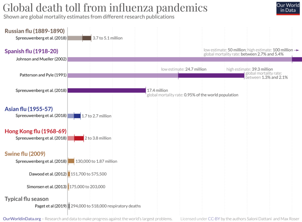
Estimates suggest that the world population in 1918 was 1.8 billion.
Based on this, the low estimate of 17.4 million deaths by Spreeuwenberg et al. (2018) implies that the Spanish flu killed almost 1% of the world population.9
The estimate of 50 million deaths published by Johnson and Mueller implies that the Spanish flu killed 2.7% of the world population. And if it was in fact higher – 100 million as these authors suggest – then the global death rate would have been 5.4%.10
The world population was growing by around 13 million every year in this period which suggests that the period of the Spanish flu was likely the last time in history when the world population was declining.11
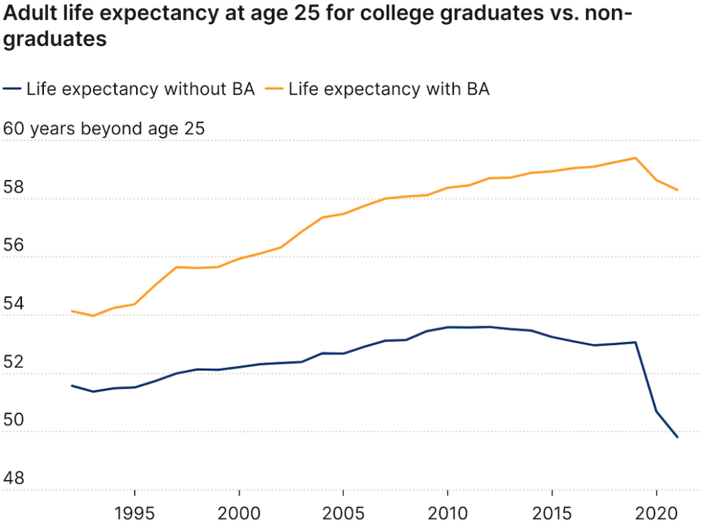
The Post reported that some politicians pointed to the rising death toll from “lethal drug overdoses” as a significant factor in declining U.S. life expectancy. The Post did, however, acknowledge that drug deaths “are not solely responsible for the decline in life expectancy.” It is worth noting that opioid overdose deaths began truly soaring after 2010 when users turned to illicit heroin and fentanyl after the introduction of Food and Drug Administration–approved abuse-deterrent formulations.
So how much do drug overdose deaths contribute to the recent decline in U.S. life expectancy? A 2021 comprehensive review of factors affecting mortality trends in the U.S. between 1999 and 2018 found that average life expectancy would “have been 0.3 years greater were it not for increases in unintentional drug poisoning.” In a 2023 preprint article, two Johns Hopkins University researchers calculated that opioid overdose deaths between 2019 and 2021 reduced U.S. life expectancy by 0.65 years. If politicians and policy makers really want to make increasing life expectancy a priority, one huge step would be to actually end the war on drugs. A cease-fire in the drug war would likely reduce gun deaths too.
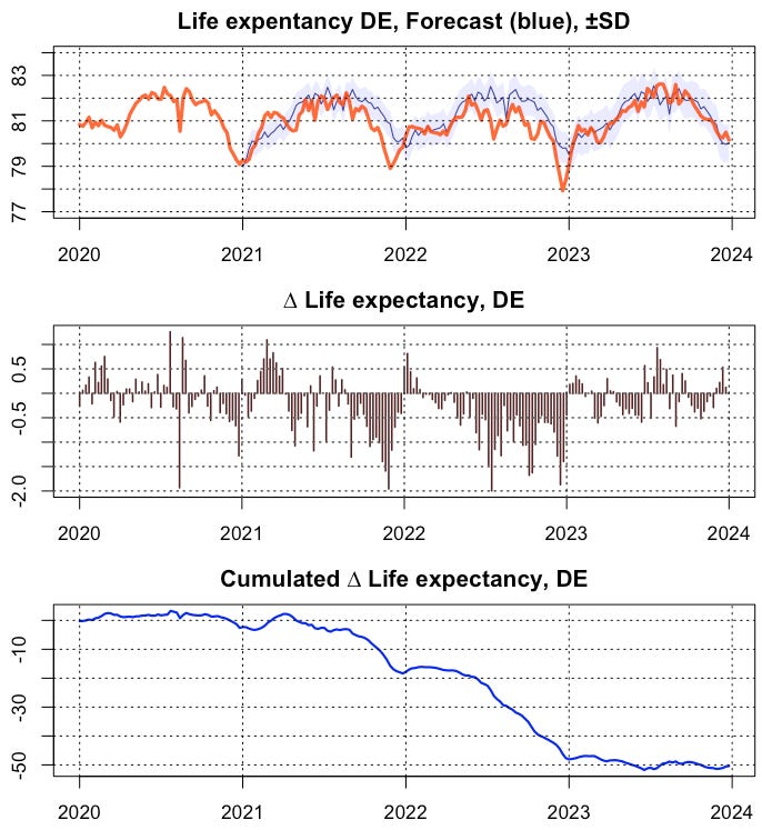
Destatis yesterday published deaths figures for the whole of 2023. In order to obtain a reliable assessment of the situation, I calculated the weekly time series of life expectancy, applied an ARIMA forecast from the reference epoch 2016-2020 and compared it with the actual values. In this way, results are now available for all 4 pandemic years to date (Fig. 1)