Link: https://marypatcampbell.substack.com/p/which-public-pension-funds-have-the
Graphic:

Excerpt:
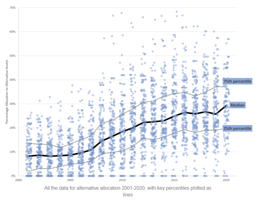
What you see in that graph is a data point for each of the plans I know their asset allocation for, with the median, 25th percentile, and 75th percentiles marked out so you can see the allocations increasing.
That pattern does not make me feel good.
Allocating more to alternatives doesn’t seem to get asset managers higher returns. But the group is generally sliding upwards in their allocations, and I’m very unhappy about this.
Author(s): Mary Pat Campbell
Publication Date: 11 May 2021
Publication Site: STUMP at substack