Link: https://marypatcampbell.substack.com/p/mortality-nuggets-nyt-misleads-covid
Graphic:

Excerpt:
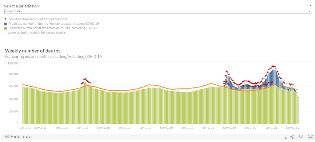
I want you to notice something — the blue bars are the “with COVID” portion of deaths, and the chartreuse bars are the ones “without COVID”. The bars are weekly counts of deaths when they occurred. Ignore the most recent weeks because they don’t have full data reported yet.
The red pluses indicate excess mortality, defined as exceeding the 95th percentile for expected mortality for that week (so it includes seaonality). You can see the excess mortality from the 2017-2018 flu season, which was bad for a flu season.
The non-COVID mortality has been in excessive mortality range for almost all 2020 after March. But since the beginning of 2021, it has dropped off…. and COVID mortality has also dropped off.
I think we may be almost in “normal” range soon. We shall see!
Author(s): Mary Pat Campbell
Publication Date: 13 June 2021
Publication Site: STUMP at substack