Link: https://uxdesign.cc/data-visualizations-choosing-colors-with-purpose-4a672ac0215a
Graphic:
Excerpt:
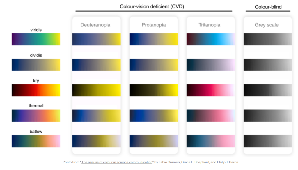
The incorporation of intuitive color maps in data visualizations is an extremely useful tool, but has one major drawback: the information conveyed by the colors is lost to those who cannot distinguish between them. According to the Colour Blind Awareness Organisation (UK-based), approximately 8% of men and 0.5% of women worldwide have some form of color vision deficiency (CVD). Fortunately, certain scientifically derived color maps have been created which are able to maintain distinguishability across various different types of color blindness. Several such color maps are shown below with their corresponding CVD-adjusted perceptions.
Author(s): T. J. Kyner
Publication Date: 30 April 2021
Publication Site: UX Collective
