Link: https://livefreeordichotomize.com/2021/04/07/nytimes-map-how-to/
Graphic:
Excerpt:
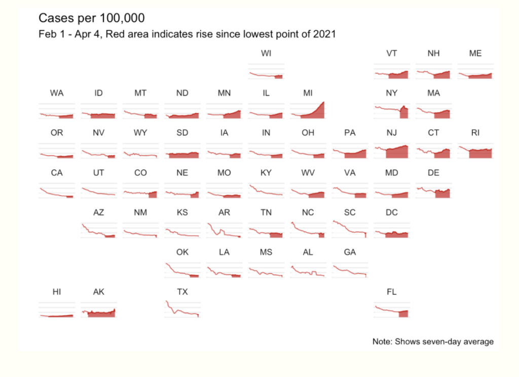
There was a recent email thread in the IsoStat listserv about a cool visualization that recently came out in the New York Times showing COVID-19 cases over time. This sparked a discussion about whether this was possible to recreate in R with ggplot, so of course I gave it a try!
Author(s): Lucy D’Agostino McGowan
Publication Date: 7 April 2021
Publication Site: Live Free or Dichotomize