Link: https://www.axios.com/graphing-the-pandemic-6b62e35a-8481-4287-bcab-70d4b2fc2091.html
Graphic:
Excerpt:
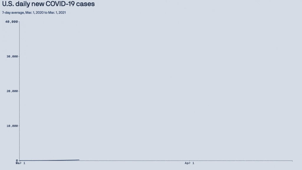
2020: The year the y-axis broke
Why it matters: Changes that typically take months or years to show up on a trend line started happening in weeks — resulting in a year of numerical outliers that will be breaking the axis for decades to come.
The result was two-fold:
Y-axes need to be continually adjusted to accommodate ever-higher numbers.
Longer term, there’s now a year of graphical outliers that future charts will have to account for.
Author(s): Mike Allen
Publication Date: 13 March 2021
Publication Site: Axios