Graphic:

Excerpt:
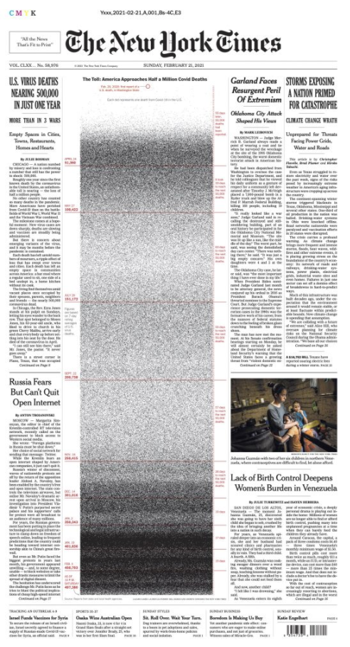
The more I think about today’s front page of the New York Times, the more it is for me another watershed moment for data visualization. But not for good reasons.
This graph is confronting us with the limitations of data visualization to convey tragedies.
Author(s): Francis Gagnon
Publication Date: 21 February 2021
Publication Site: Chez Voila