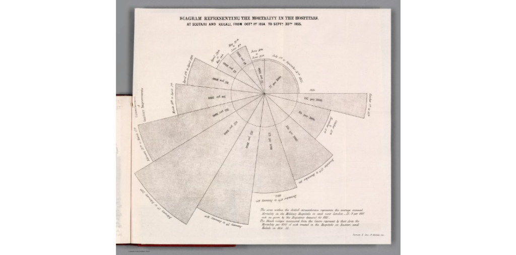
Link: https://exhibits.stanford.edu/dataviz/
Description: Exhibit of historical data visualization examples
There is a magic in information graphics. Maps float you above the land for a bird’s eye view. Timelines arrange memories on the page for all to see. Diagrams reveal the parts inside without requiring disassembly, or incision.*
❡ Data visualization leapt from its Enlightenment origins and into the minds of the general public in the 1760s. It cast more powerful spells throughout the following century. By 1900, modern science, technology, and social movements had all benefited from this new quantitative art. Its inventions include the timeline, bar chart, and thematic map. Together, these innovations changed how we understand the world and our place within it. Data visualization helped a new imagination emerge, wired to navigate a reality much bigger than any single person’s lived experience.
❡ The sections in this exhibition examine information graphics that show space, time, nature, and society. Many are beautiful. Each is a unique way of seeing still worth our attention. —RJ Andrews, guest curator

Curator: RJ Andrews
Publication Date: September 2020
Site: Stanford University